
My dear fashionistas, welcome to a new fashion story on the Mr.M blog. Some outfits announce themselves immediately. This Valentino summer outfit did not. I circled it for nearly three weeks, pulling pieces out of the wardrobe and putting them back again. Nothing felt wrong, yet nothing felt finished either. Then one warm morning above the confluence of the Sava and the Danube, everything finally settled into place.
The formula sounds almost too simple. White linen, blue denim, white leather and one watch. Men have worn some version of that for decades, and most of them have worn it badly. What separates a good version from a forgettable one is never the concept. It comes down to proportion, fabric weight, and the handful of details that reward a second look.
That last element deserves a warning. The tourbillon on my wrist carries a dial struck by hand more than a thousand times, and I have given it a proper chapter further down. Read that part slowly if watches interest you at all.
Below, I want to walk you through everything: how the pieces behave in real heat, why Maison Valentino still matters more than six decades after it opened in Rome and how a watch factory in northeast China ended up making one of the more surprising watches I own.


VALENTINO: WHY THIS SUMMER LOOK WORKS
Start with the silhouette, because everything else follows from it. The shirt runs long and wide. The jeans run straight and full. Together they create volume without shapelessness, which is a harder balance than it looks.
Most men default to the opposite. They buy slim shirts and slim jeans, then wonder why they look constricted rather than composed. Volume, used deliberately, reads as confidence. Volume by accident reads as a bad size guess.
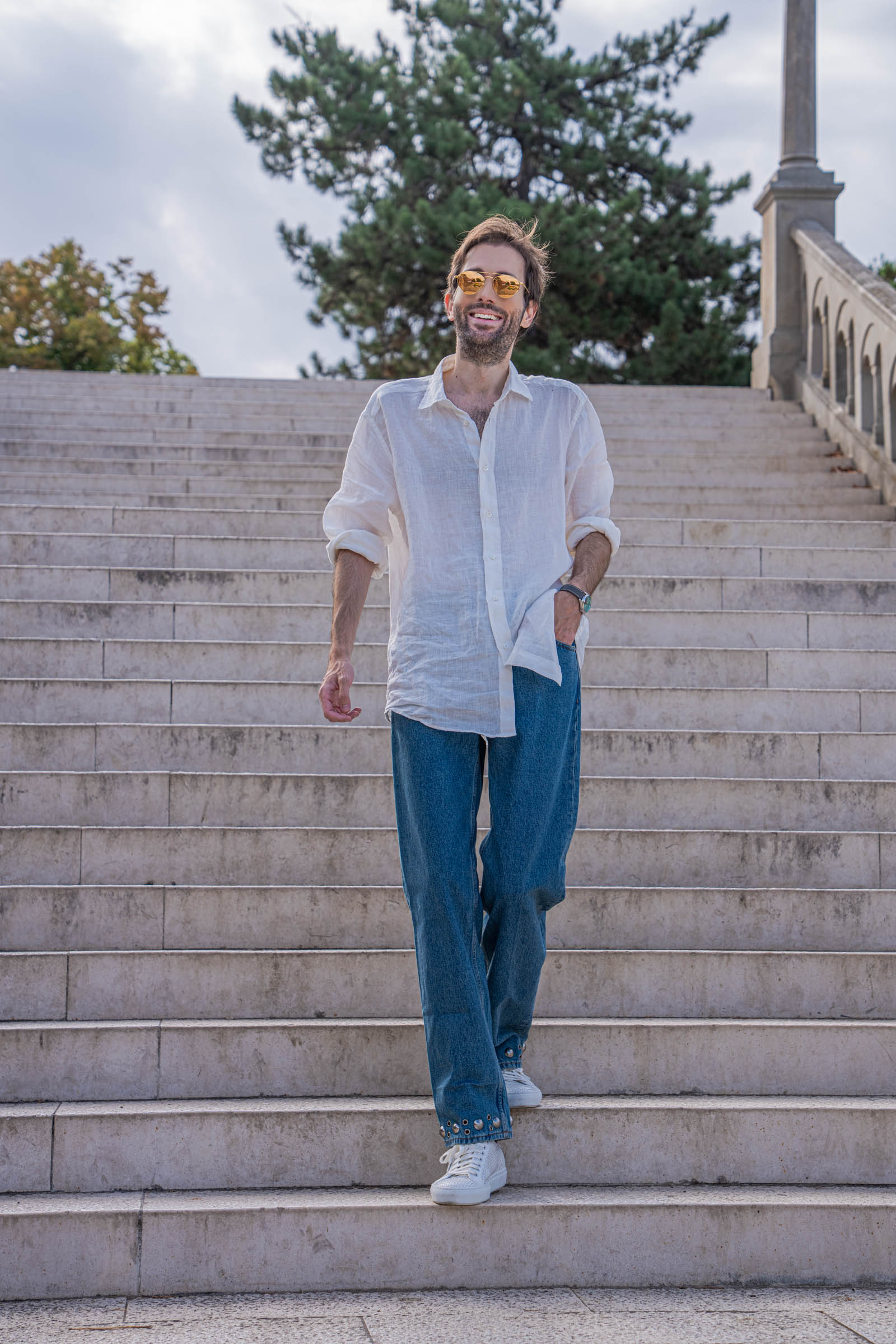
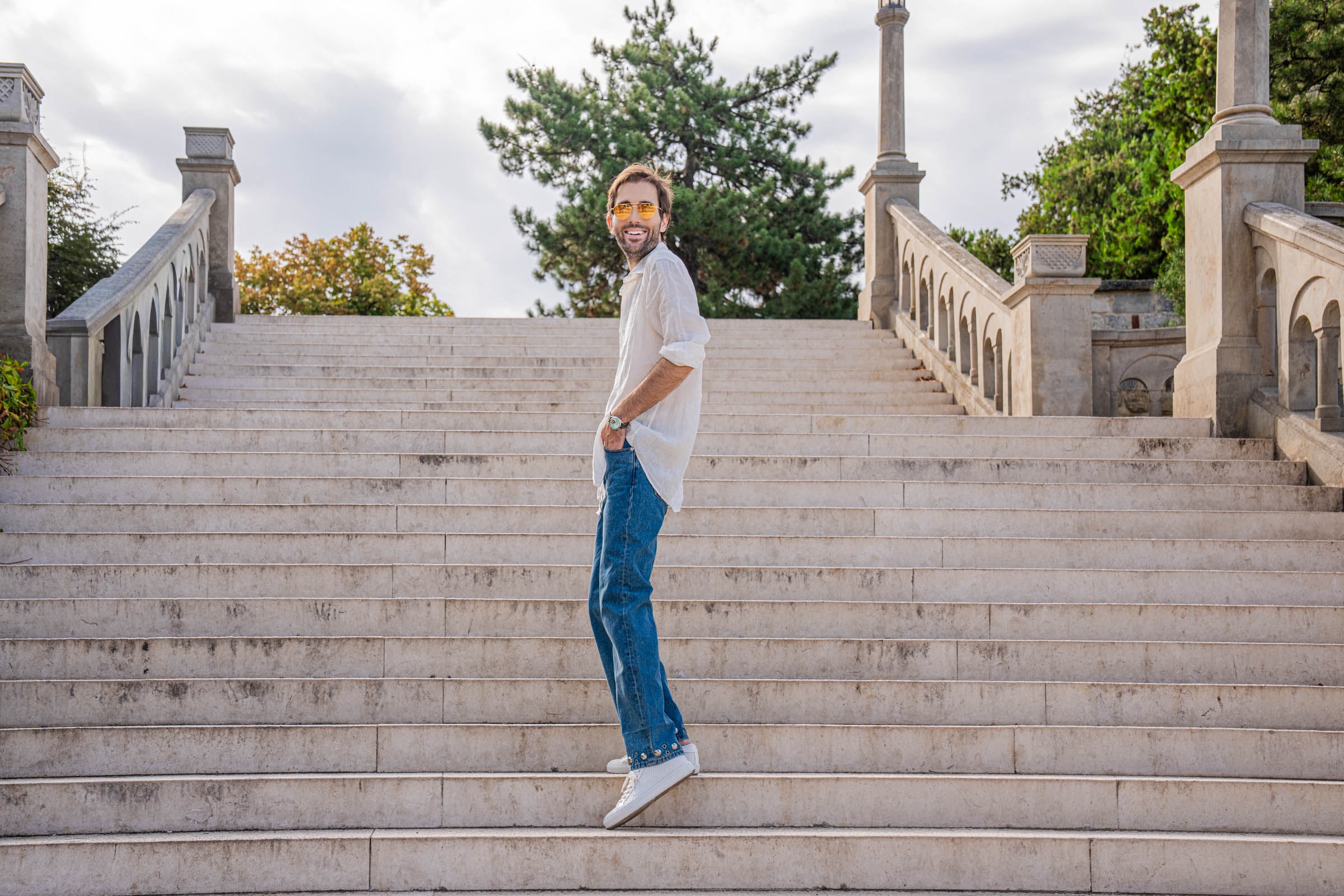
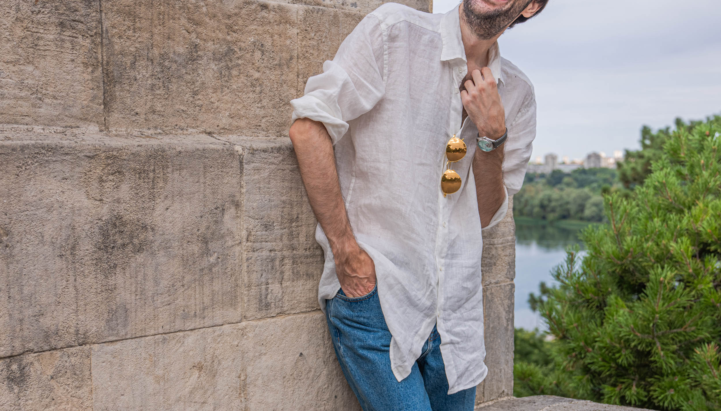
The color story stays equally disciplined. Optic white on top, mid-blue denim below, white leather on the feet. Three tones, nothing more. Consequently, the eye has nowhere to snag, and the small metallic details do all the talking. Those details matter enormously here. Silver studs ring the hem of the jeans. Gold sits on the bridge of the sunglasses. A pale glacial-green dial glows on the wrist. Each one is small. Each one is placed where a person actually looks.
Finally, there is the question of ease. This Valentino summer outfit does not require me to hold my posture or check a mirror every twenty minutes. I wore it for a full morning of walking across uneven stone, and it never fought me once. For me, that has become the real test of good clothing.
VALENTINO OVERSIZED WHITE LINEN SHIRT: THE SUMMER ESSENTIAL
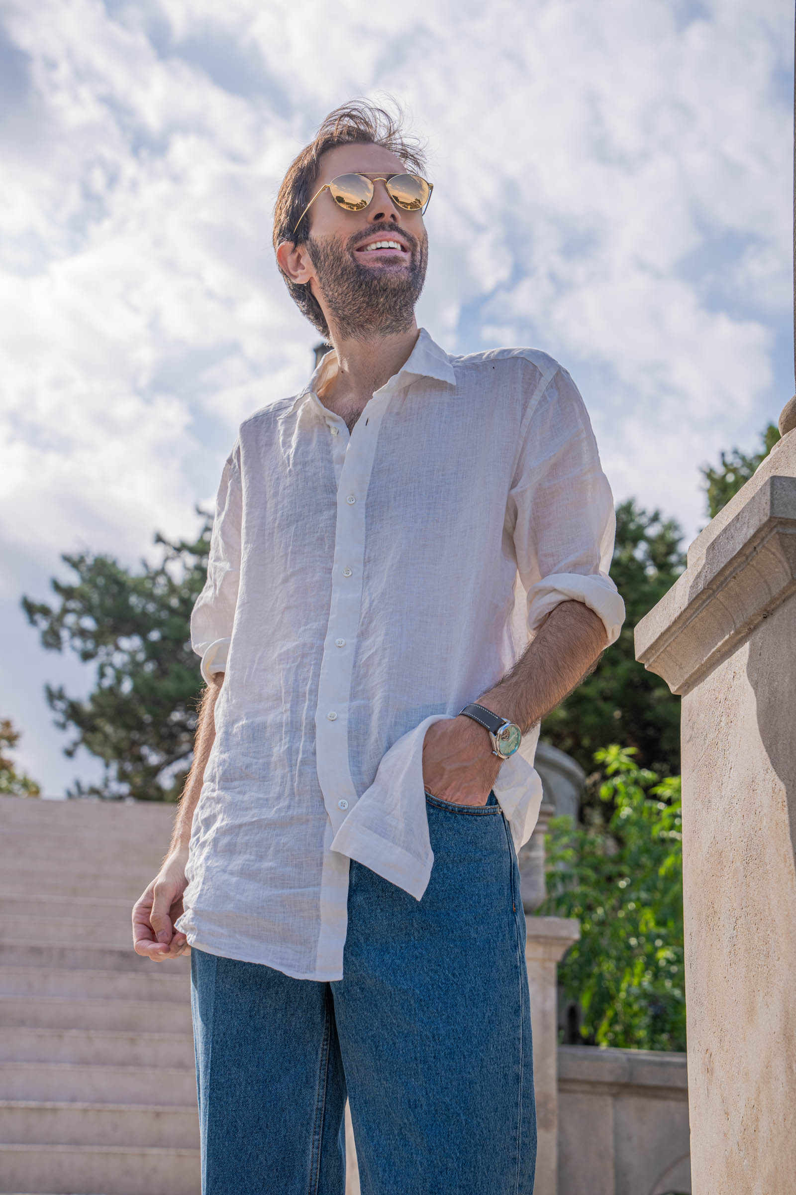
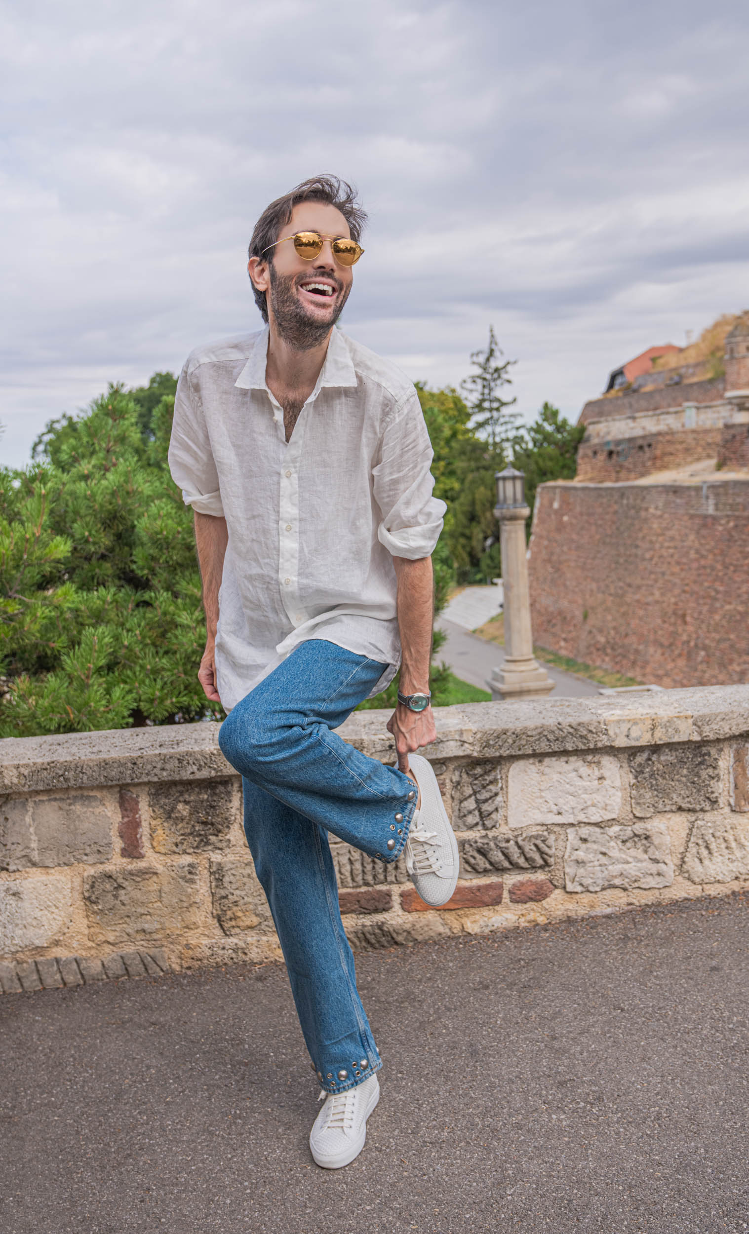
The shirt is the anchor of the whole look and it is a Valentino runway piece. It arrives in a fine, almost translucent linen, cut long enough to sit well below the hip. Two side vents open at the bottom so the fabric moves instead of bunching.
Look closely at the photographs and you can see light passing straight through the weave. That transparency is not a flaw. Rather, it tells you exactly how open the yarn is, and open yarn is the entire point of summer linen.
HOW LINEN ACTUALLY BEHAVES IN REAL HEAT
Linen comes from flax, and flax fiber is hollow. As a result, it absorbs moisture readily and releases it fast. The fabric lifts away from the skin instead of clinging, which creates a small pocket of moving air across your back.
Cotton does the opposite once you sweat. It holds water, turns heavy, and sticks. Anyone who has spent August in a Mediterranean city already knows the difference without needing the science.
The trade-off, of course, is wrinkles. Linen creases the moment you sit down, and no finishing process fully prevents it. Personally, I stopped fighting this years ago. Those creases are the signature of the fiber, and a perfectly flat linen shirt usually means the blend has been compromised.
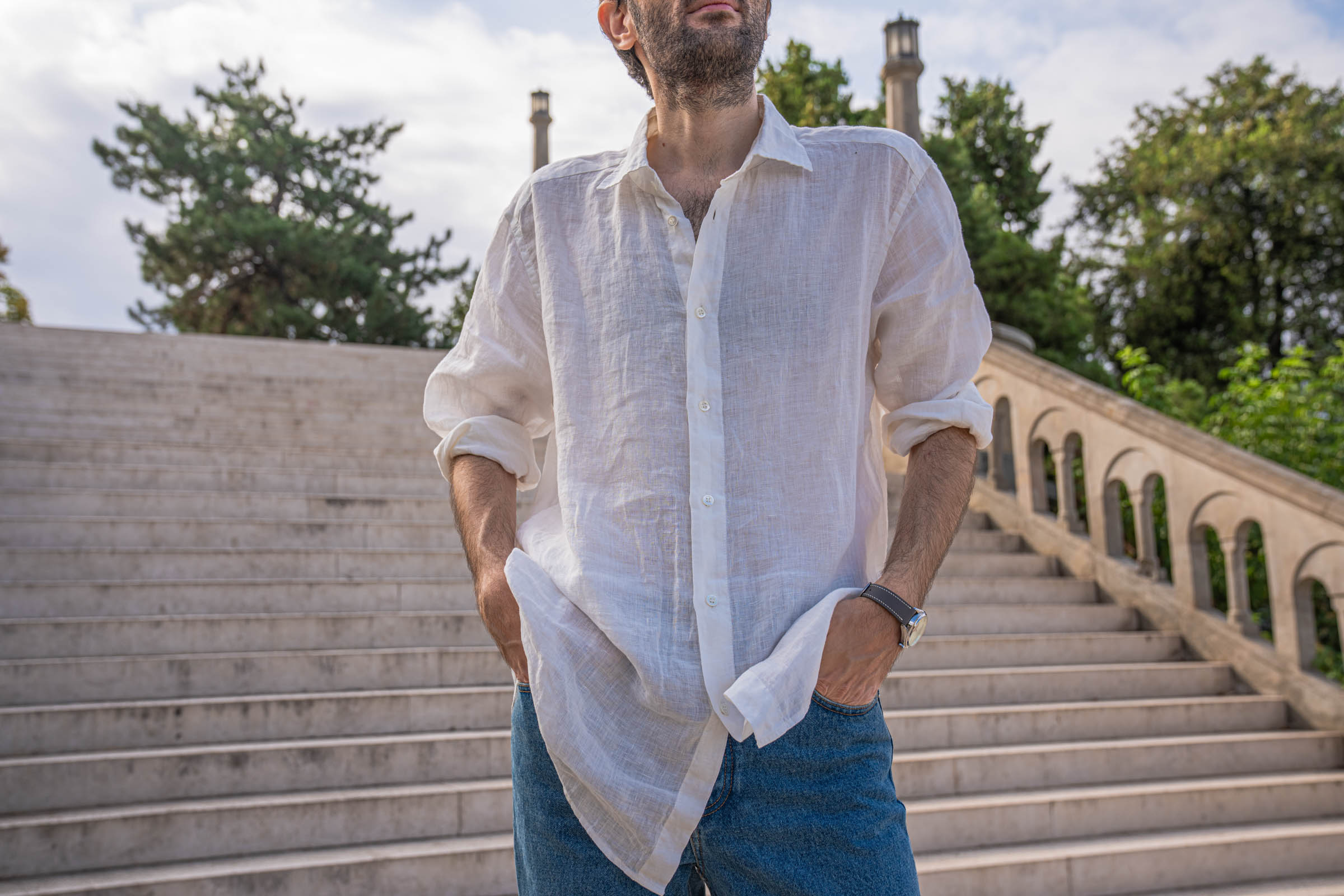
HOW I SIZE AN OVERSIZED SHIRT
Oversized does not mean “buy two sizes up.” That approach produces a tent, not a silhouette. Instead, I look at three fixed points.
First, the shoulder seam should fall past the natural shoulder, but not halfway down the arm. Second, the cuff should still close properly, because rolled sleeves need structure to hold their shape. Third, the hem should clear the hip without reaching mid-thigh.
Get those three right and the extra volume reads as intentional. Get them wrong and it simply reads as borrowed.

VALENTINO JEANS: STUDS, EYELETS & A TOUCH OF ATTITUDE
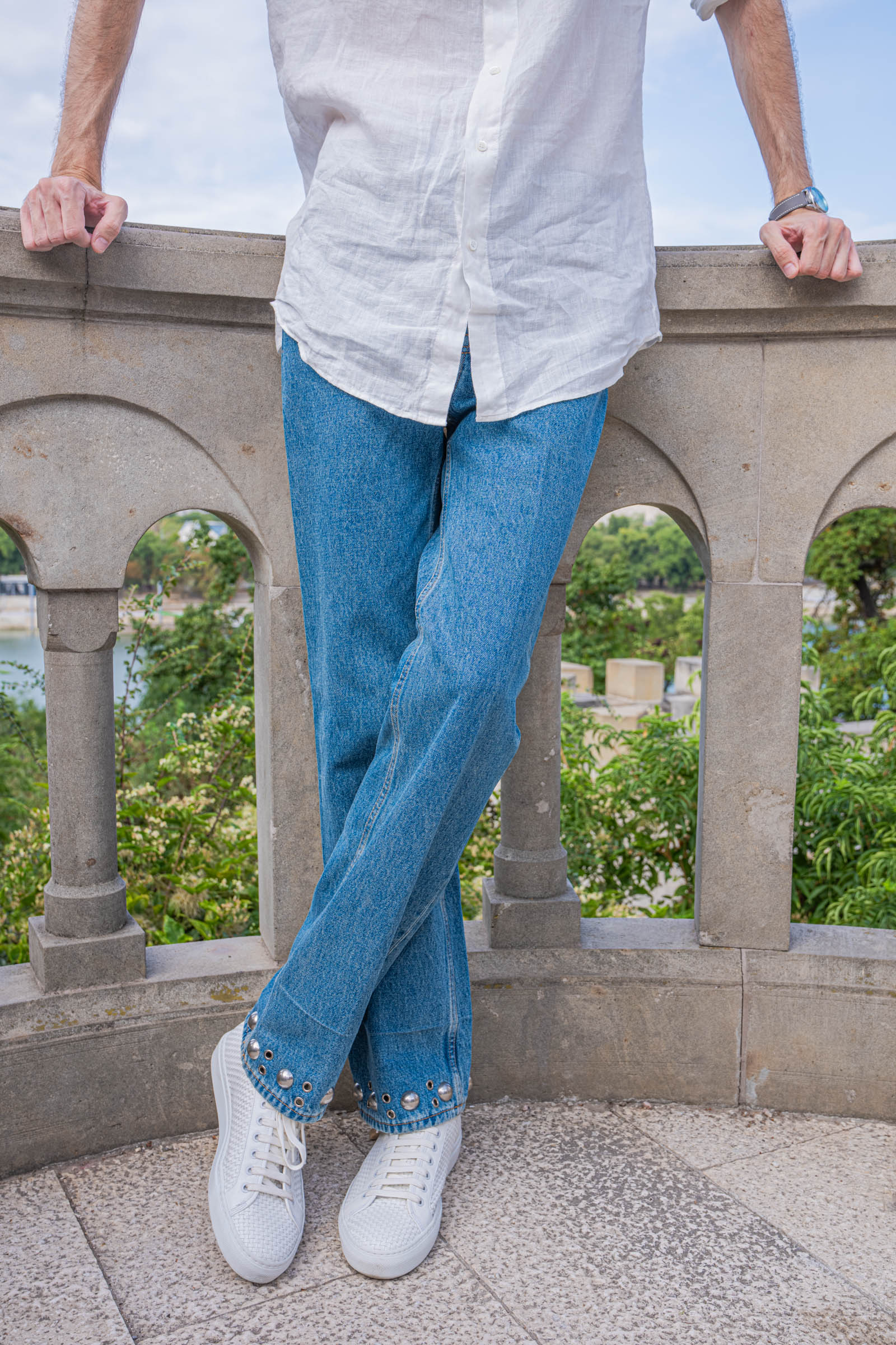
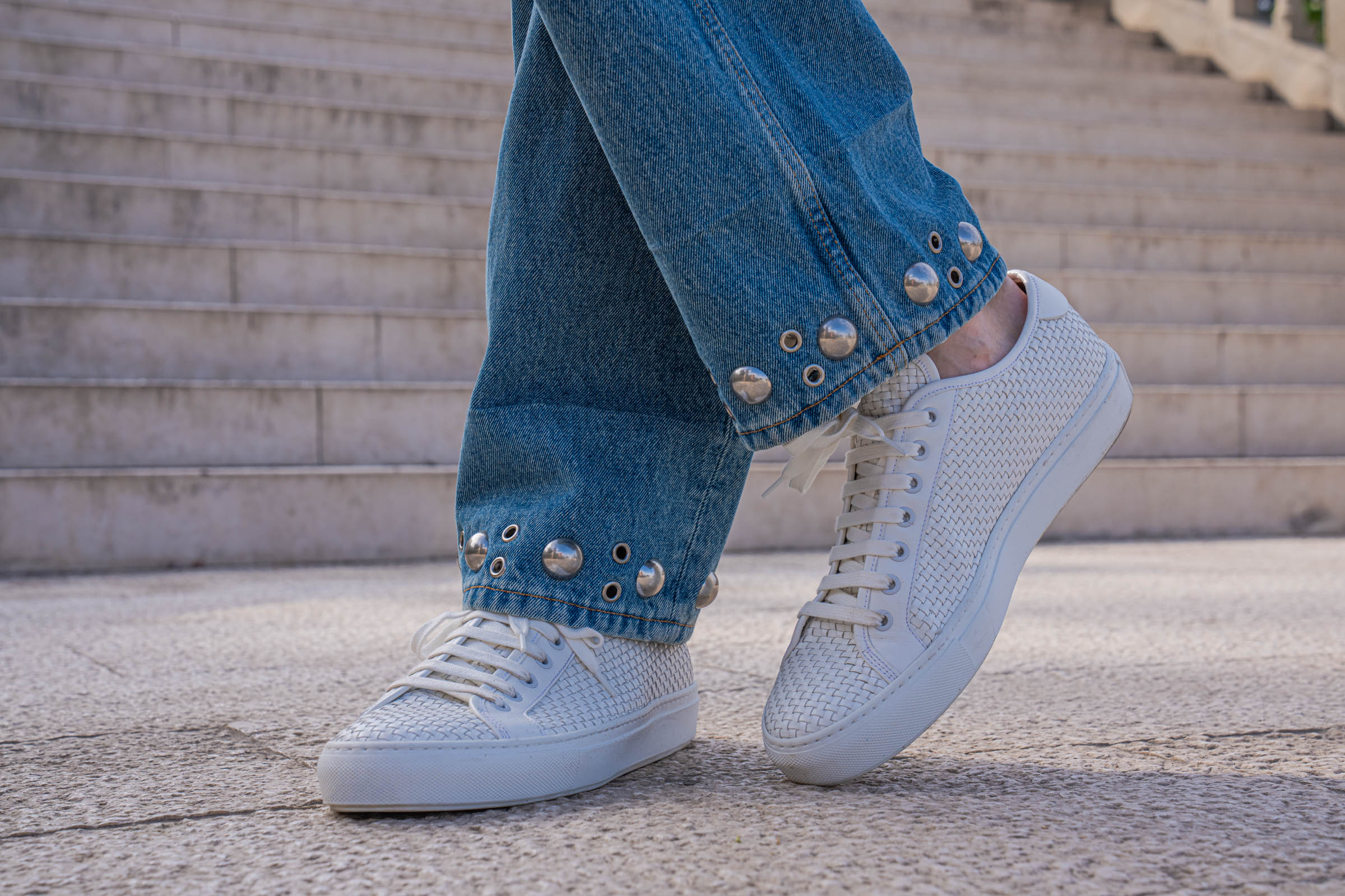
The denim is where this Valentino summer outfit stops being a familiar formula and becomes something specific. These are Valentino’s five-pocket jeans with studs and eyelets in color 558, from the Spring/Summer 2026 collection. They are 100% cotton, made in Italy.
The cut stays deliberately conventional. Regular fit, straight leg, mid-rise waist, belt loops, button fly. No distressing, no fashion washes, no exaggerated taper. On their own, they would pass for excellent plain denim.

WHAT THE HEM ACTUALLY DOES
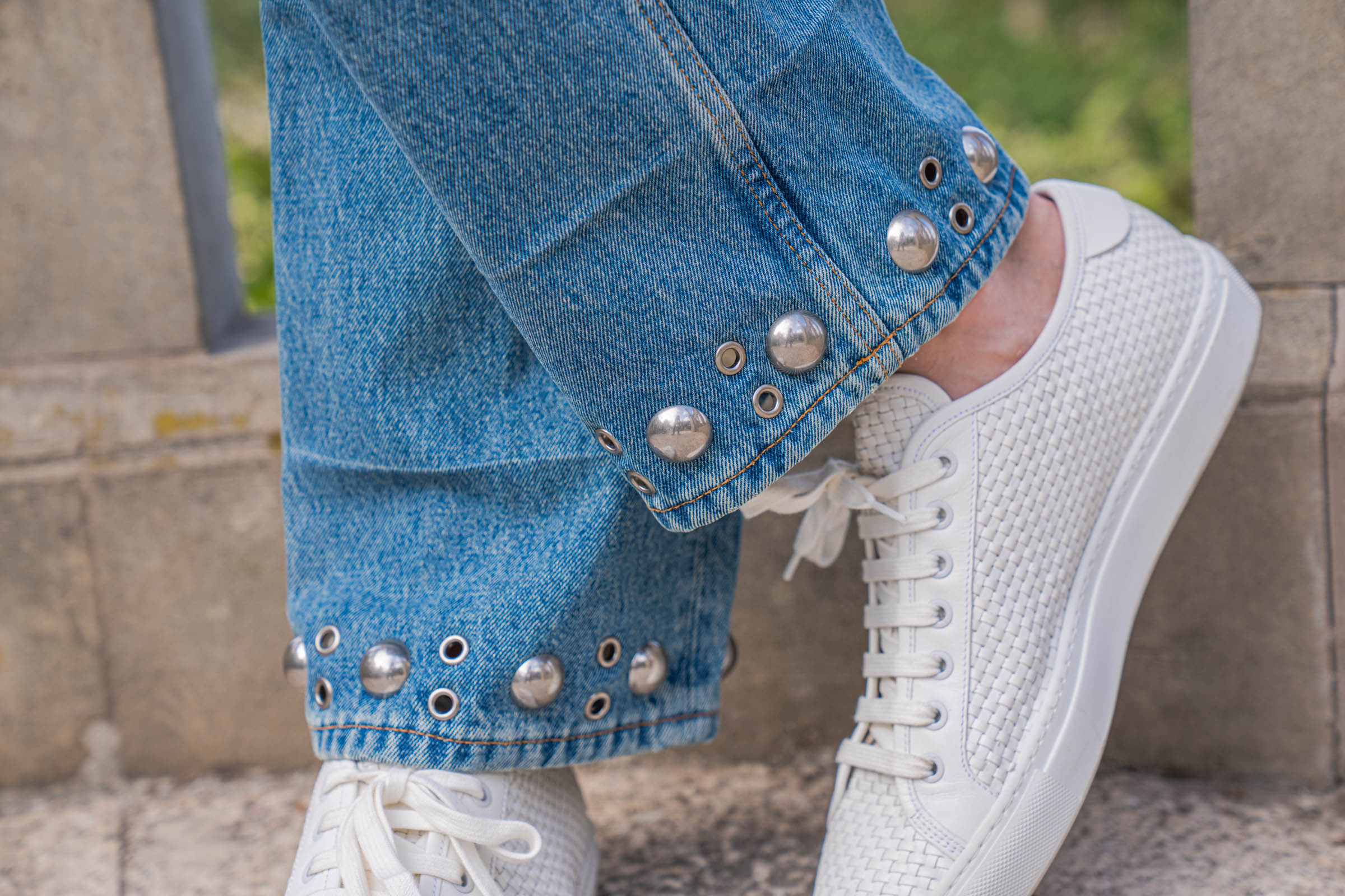
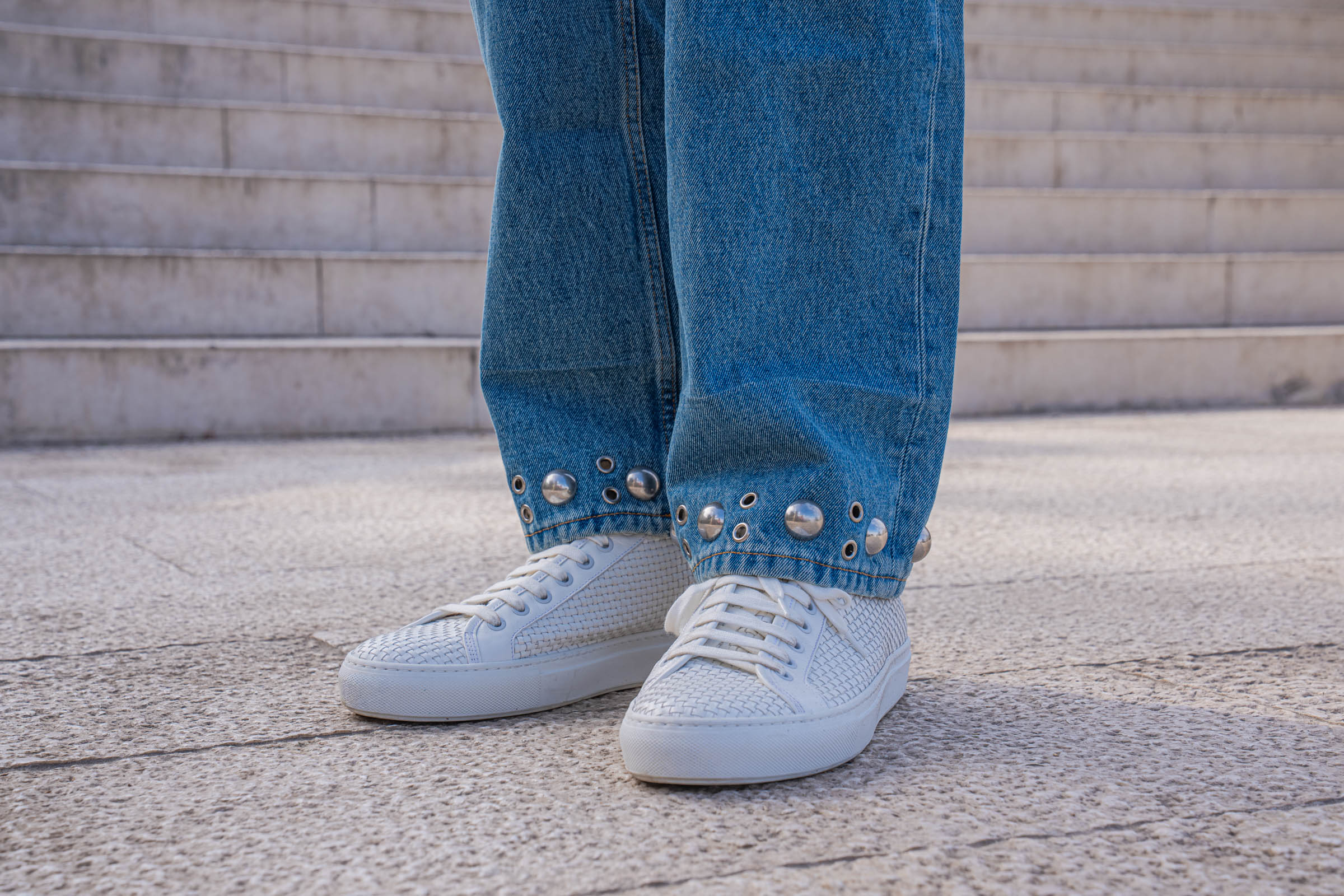
Then you reach the bottom of the leg. Valentino rings each cuff with silver-finished metal eyelets alternating with large semi-spherical studs, set in a continuous band around the opening.
The effect is quietly clever. Because the hardware carries weight, the hem hangs with a slight authority that ordinary denim never achieves. Moreover, the studs catch light exactly at ankle height, which draws the eye downward toward the shoes.
Studs have a long history at this house, as the next section explains. Here, though, the reference stays understated. Nobody would call these jeans loud.

VALENTINO: THE “CHEZ VALENTINO” PATCH
Turn around and you find a tan leather label at the back of the waistband. A large V fills the upper half. Beneath it, embossed in small capitals, sits the phrase “Chez Valentino.”
Alessandro Michele introduced that marking after taking creative control in 2024, and it functions as a kind of house address rather than a logo shout. I appreciate that restraint. The patch is the only place on the entire garment where the brand name appears at all.

OUTFIT
Linen Shirt: Valentino
Watch: Peacock
Denim (Jeans): Valentino
Sunglasses: Linda Farrow
Sneakers: Valentino

VALENTINO WOVEN LEATHER SNEAKERS: TEXTURE WITH A LUXURY EDGE
White sneakers have become the most over-supplied category in menswear. Practically every house makes a version, and most of them look identical at three meters.
These escape that trap through texture alone. The uppers are woven leather, with a tight basket pattern running across the toe, the quarter, and the heel counter. Everything else stays deliberately plain: white laces, white cupsole, no contrast panels, no visible branding.

Consequently, they photograph beautifully in close-up and disappear politely in full-length shots. That is exactly what I want from a shoe in a look like this. The sneakers support the outfit rather than competing with it.
Woven leather also ages differently from smooth calf. Each strand flexes independently, so the surface develops a soft, irregular patina instead of sharp creases across the vamp. In practice, they look better after a season than they did in the box.
One practical note. Woven uppers trap dust in the gaps, so a soft brush works far better than a cloth. I clean mine every few wears, and they still look close to new.
MAISON VALENTINO: SIX DECADES OF ROMAN ELEGANCE
A post like this deserves proper context, because the name on these labels carries real weight.
Valentino Garavani opened his fashion house in Rome in 1960, backed by his father and by Giancarlo Giammetti, who would remain his partner for the rest of his life. The first atelier stood on Via Condotti. In 1967, the maison moved into Palazzo Gabrielli-Mignanelli near the Spanish Steps, where its creative direction still sits today.
Garavani had trained in Paris, at the École des Beaux-Arts and the Chambre Syndicale, before working in the ateliers of Jean Dessès and Guy Laroche. He returned to Italy with French couture technique and Roman instincts, and that combination defined everything he made afterward. His international breakthrough came in Florence in 1962, then the Italian fashion capital of the day.

VALENTINO RED: THE COLOR THAT EARNED ITS OWN PANTONE
Valentino red began, according to the designer himself, at the opera in Barcelona. Watching Bizet’s Carmen as a young man, he noticed a woman in red velvet standing out among all the other colors in the boxes.
That memory stayed with him. He introduced the shade in his 1959 Fiesta collection, shown just before the house opened. Afterward, every single collection contained at least one red look. Pantone eventually codified the hue, an honor almost no designer receives.
VALENTINO: THE WHITE COLLECTION & THE ICONIC V
In 1967 and 1968, Valentino showed his famous “no color” collection, built entirely from white, beige and ivory while the rest of fashion chased psychedelic prints. The V logo appeared at the same moment. Jacqueline Kennedy Onassis wore a dress from that collection to her wedding, which pushed the house into global recognition almost overnight.
Menswear followed much later. Valentino staged its first men’s show at Milan Fashion Week in 1985.

VALENTINO: THE ROCKSTUD ERA & WHY IT MATTERS HERE
Garavani retired in 2007. Maria Grazia Chiuri and Pierpaolo Piccioli took over creative direction in 2008, having joined the house in 1999 to develop accessories.
Their defining contribution arrived in 2010. The Rockstud carried small pyramid studs across pumps, ballet flats and bags, and the reference was architectural rather than punk. Those pyramids echo bugnato, the rusticated stonework that faces Roman palazzi. Look at the base of almost any grand building in Rome and you will see the shape immediately.
Commercially, the line transformed the company. Sales of Rockstud sandals alone reportedly reached 152 million dollars between 2014 and 2019. Interestingly, American trademark examiners later refused protection for the design, arguing that the studs read as decoration rather than as a source identifier. The Rockrunner sneaker followed and became equally recognizable.
Michele has now revived the motif for his own tenure, with an updated version shown for pre-fall 2026.
I mention all this because the hardware on my jeans sits inside that lineage. The studs here are domed rather than pyramidal, and the scale is far quieter. Nevertheless, the instinct is identical: take a classical garment, then interrupt it with metal in exactly one place.
VALENTINO: PM23 & THE FONDAZIONE
In May 2025, Garavani and Giammetti opened PM23 at Piazza Mignanelli 23, steps from the original atelier. The space serves the Fondazione Valentino Garavani e Giancarlo Giammetti, which works across three pillars: philanthropy, arts and culture, and support for young talent through workshops and scholarships. Giammetti summarized the guiding idea simply. Beauty creates beauty.
The inaugural exhibition, “Orizzonti/Rosso,” opened to the public on 25 May 2025. Pamela Golbin curated the fashion, and Anna Coliva curated the art. Around thirty modern and contemporary works, including pieces by Jeff Koons, Gerhard Richter and Jean-Michel Basquiat, hung alongside fifty red haute couture creations spanning five decades. Golbin made a striking observation about that body of work: you cannot tell which dress belongs to which period.
A second exhibition followed. “VENUS,” built around twelve works by Portuguese artist Joana Vasconcelos in dialogue with thirty-three Garavani creations, opened on 18 January 2026. Garavani died the next day.
His public viewing then took place at Piazza Mignanelli, inside that exhibition, in the building his house has occupied since 1967. Few endings in fashion have felt so precisely composed.

REMEMBERING VALENTINO GARAVANI
Valentino Garavani died at his Roman residence on 19 January 2026, aged 93. Thousands queued during the two-day lying in state, and the funeral took place on 23 January at the Basilica di Santa Maria degli Angeli e dei Martiri.
Ownership of the house has shifted several times since he and Giammetti sold in 1998. Today Mayhoola holds 70 percent and Kering holds 30 percent, following Kering’s purchase in July 2023. Alessandro Michele has led creative direction since April 2024, and Riccardo Bellini became chief executive in August 2025.
I dressed for this shoot several months after that January morning. Wearing the house now carries a slightly different weight than it did before, and I think that is appropriate. A wardrobe should hold memory as well as taste.

PEACOCK DIVINE CRAFT TOURBILLON: WHERE CRAFT MEETS CHARACTER
Now to the watch, because the collectors reading this deserve genuine detail rather than adjectives.
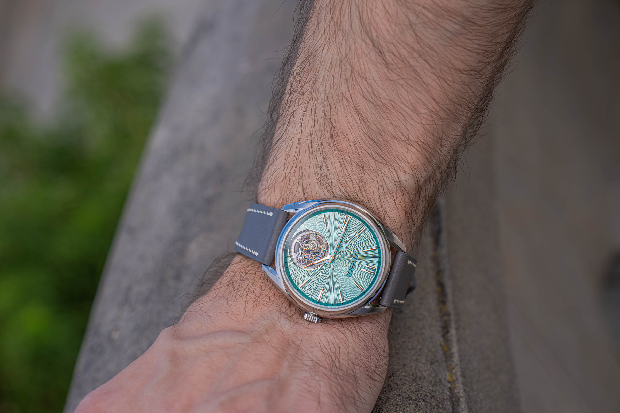
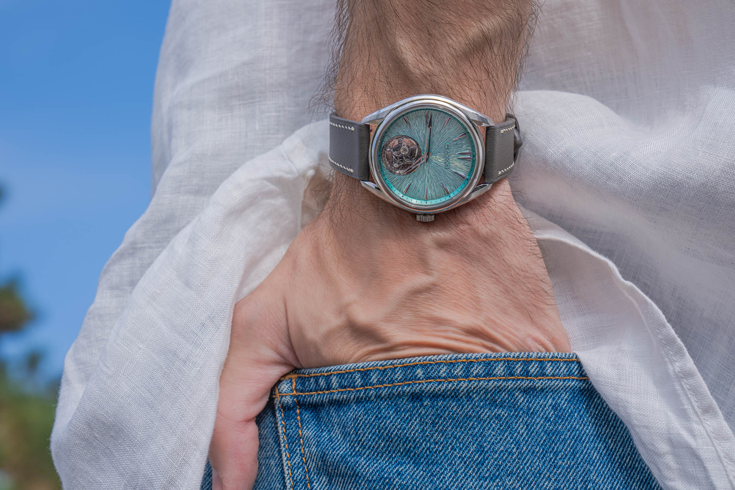
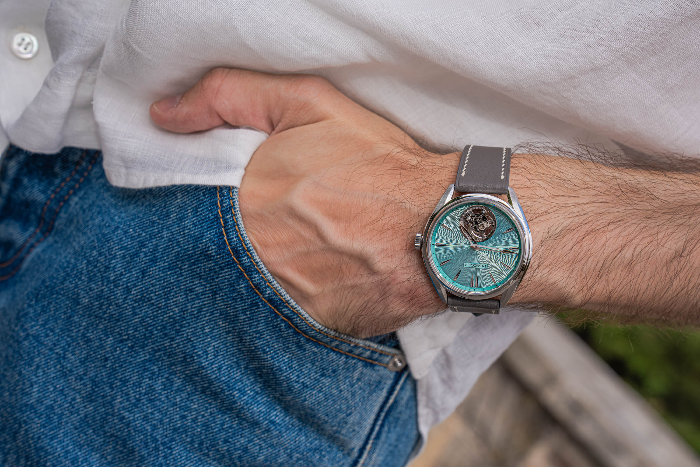
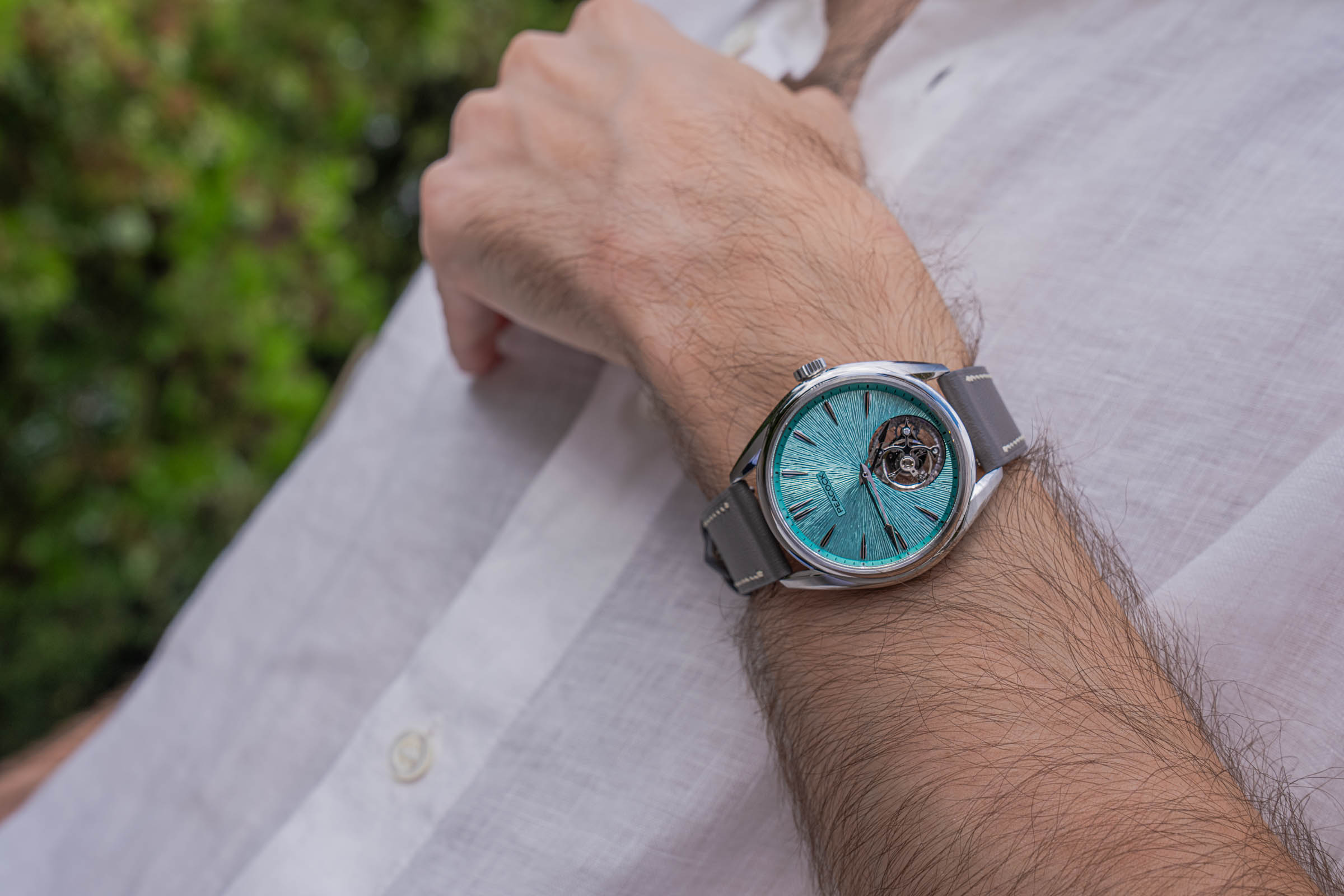
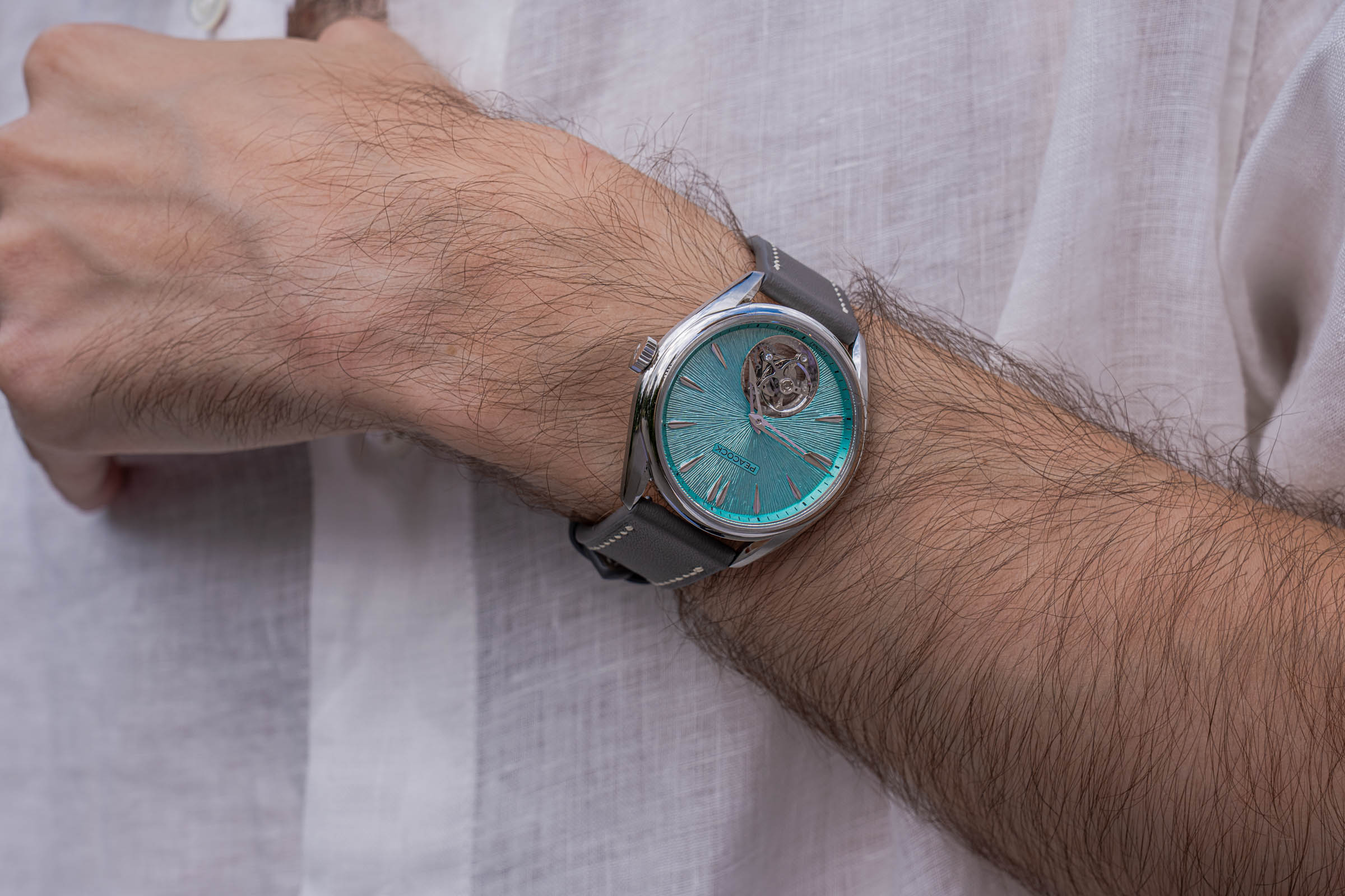
The piece on my wrist is the Peacock Divine Craft Hand-Made Micro-Engraved Ultra-Thin Tourbillon, in the Glacial Green colorway that the brand writes as 泠. Peacock limits each color to 108 pieces. Mine is number 48, engraved on the caseback alongside the reference PCG0601.
PEACOCK DIVINE CRAFT: A DIAL STRUCK BY HAND MORE THAN A THOUSAND TIMES
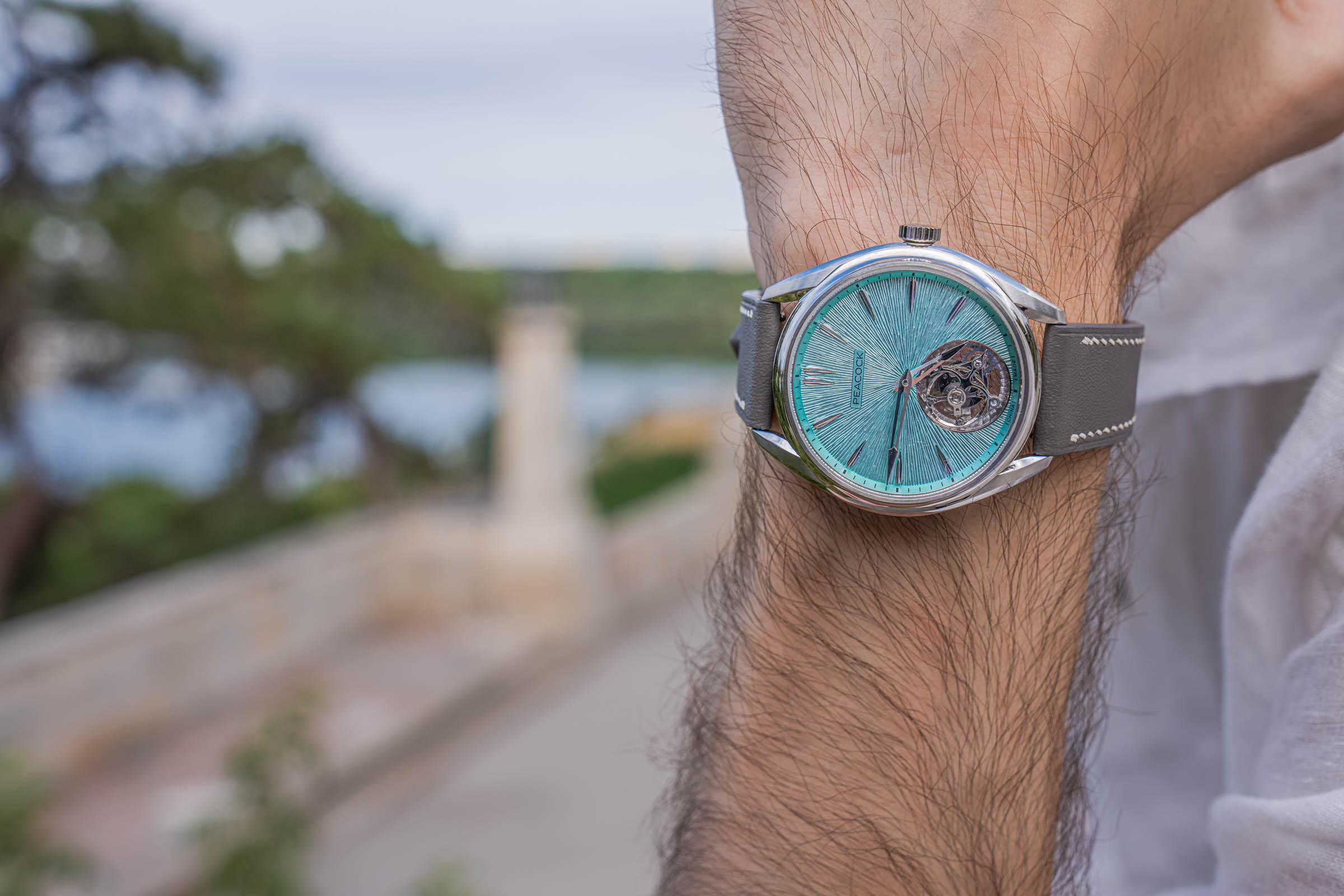
The dial is not stamped, printed or machine-guilloché. Instead, it is micro-chased, a traditional metal-sculpting craft rarely attempted at this scale in watchmaking.
Peacock explains the process in unusual detail. The artisan works on a surface only 30 mm across, using three custom-made chasing tools of different thicknesses. Each line begins as a hairline guide, followed by controlled hammering. A deviation of one degree, or a difference of one gram in force, breaks the balance of the whole field.
The finished dial carries over a thousand individually struck lines arranged in three radial layers, moving from coarse at the edge to dense at the center.
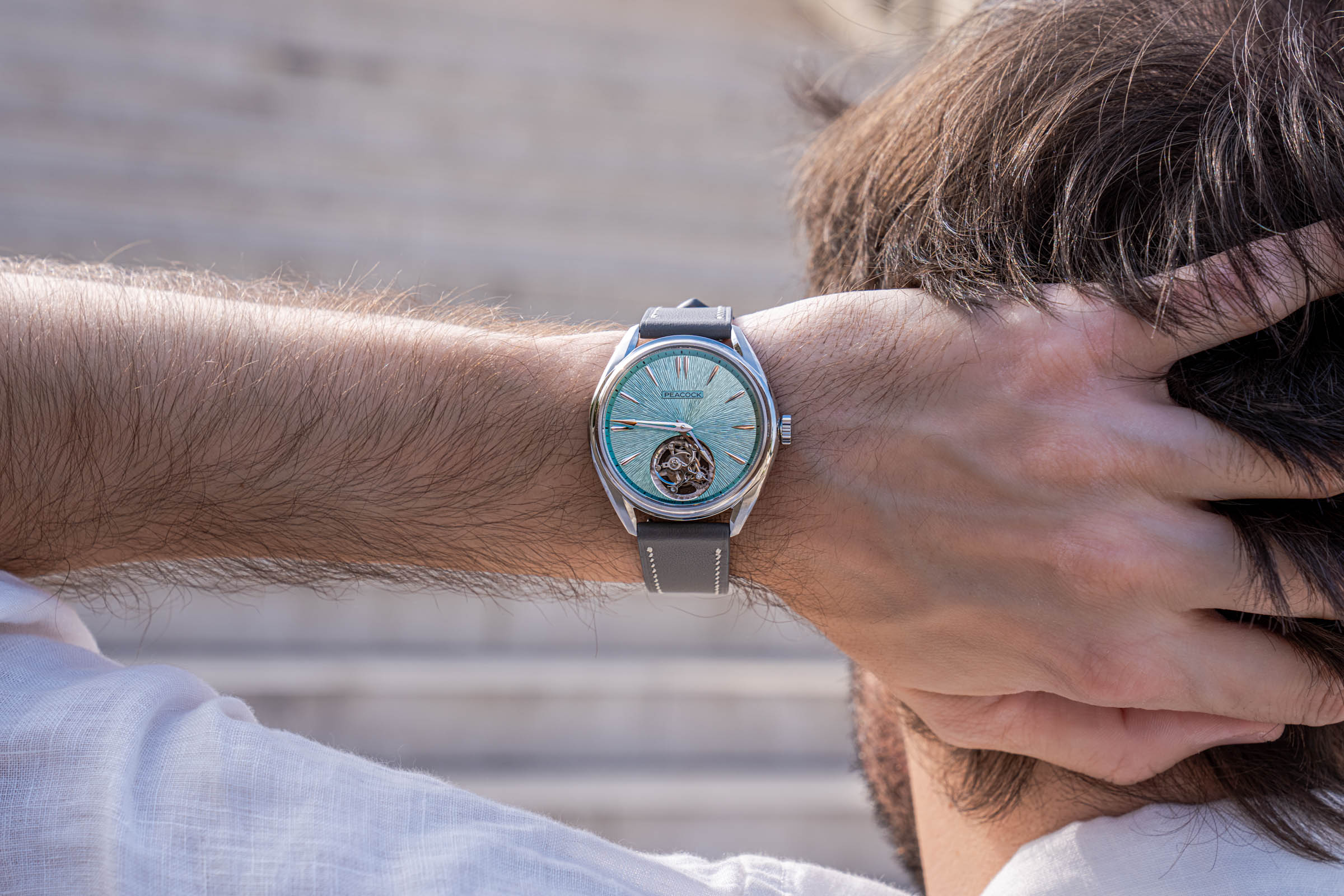
You can see the consequence across my photographs. In open shade, the dial reads as pale frosted mint. In direct sun, it deepens toward a proper glacial green, and the outer minute track sits noticeably darker than the center. No two images show quite the same color, which is precisely the point of a hand-worked surface.

MASTER ZHAO YI: THE ARTIST BEHIND THE DIAL
The dial comes from Professor Zhao Yi, a contemporary jewelry artist at the Beijing Institute of Fashion Technology. Her work bridges ancient metal craftsmanship with modern artistic language, combining lacquer with metal and reviving techniques such as chasing and forging.
In 2018 she won the Cominelli Prize in Italy, one of Europe’s highest honors in contemporary jewelry. Peacock states that the development of this dial took roughly six months.
PEACOCK DIVINE CRAFT: INSIDE THE PAX9610A
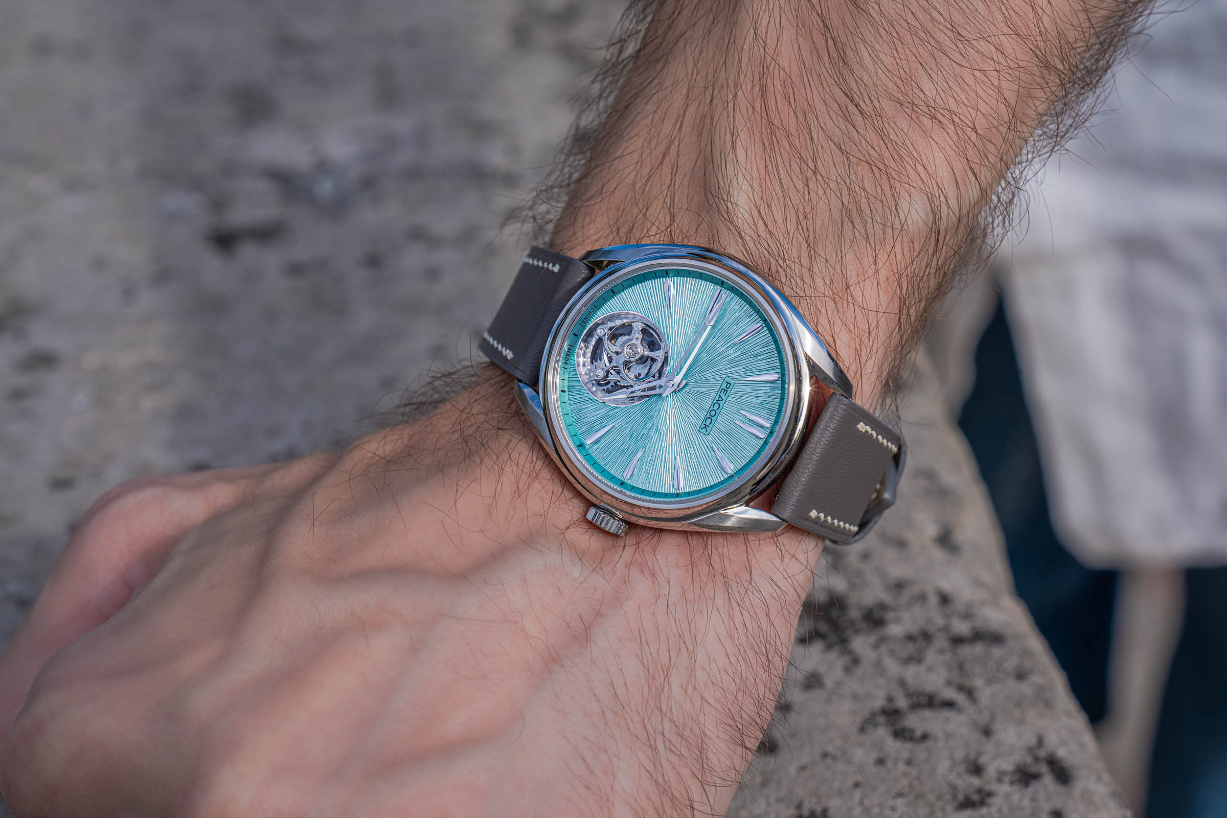
The movement is the Peacock caliber PAX9610A, a hand-wound flying tourbillon measuring just 3.5 mm thick. It runs at 28,800 vibrations per hour with 24 jewels and a 68-hour power reserve.
Two elements deserve attention. First, the flying tourbillon carries no upper bridge over the rotating cage, a construction originally developed in Glashütte. Second, the balance is free-sprung, with adjustable inertia weights that preserve the hairspring’s geometry and improve isochronism.
The tip of the cage carries a small diamond and functions as a running seconds indicator, although the aperture holds no scale for it.
FINISHING YOU ONLY SEE THROUGH THE CASEBACK
Turn the watch over and the sapphire display back reveals where most of the labor actually went.
The main plate carries hand-finished perlage, laid beneath hand-applied circular Geneva stripes. Those two treatments sit in layers rather than side by side, which is considerably harder to execute cleanly. The great wheel then adds a dual rotational motif, while the smaller wheels receive a micro-spiral pattern. Each of these requires hand-calibrated pressure, since too much force flattens the texture and too little leaves it invisible.
Beveling is where Peacock pushes hardest. The movement carries four internal sharp angles and one external angle, polished by hand until the edges reflect light like silk. Internal angles cannot be produced by machine at all, which is why watch collectors treat them as a genuine marker of hand work rather than marketing language.
Even the screws received attention. The tourbillon’s “Peacock Eye” screws have 200-micron recesses formed by precision chemical etching instead of machining. Peacock then had to redesign the matching screwdrivers repeatedly, moving from brass to 316 steel and finally to high-carbon T10 steel, because the earlier versions kept breaking under torque.
None of this is visible on the wrist. That is rather the point. A caseback like this exists for the owner and for the watchmaker, not for anyone across the table from you.

PEACOCK DIVINE CRAFT: HANDS, MARKERS & STRAP
The small components repay close inspection too, and my macro shots show them clearly.
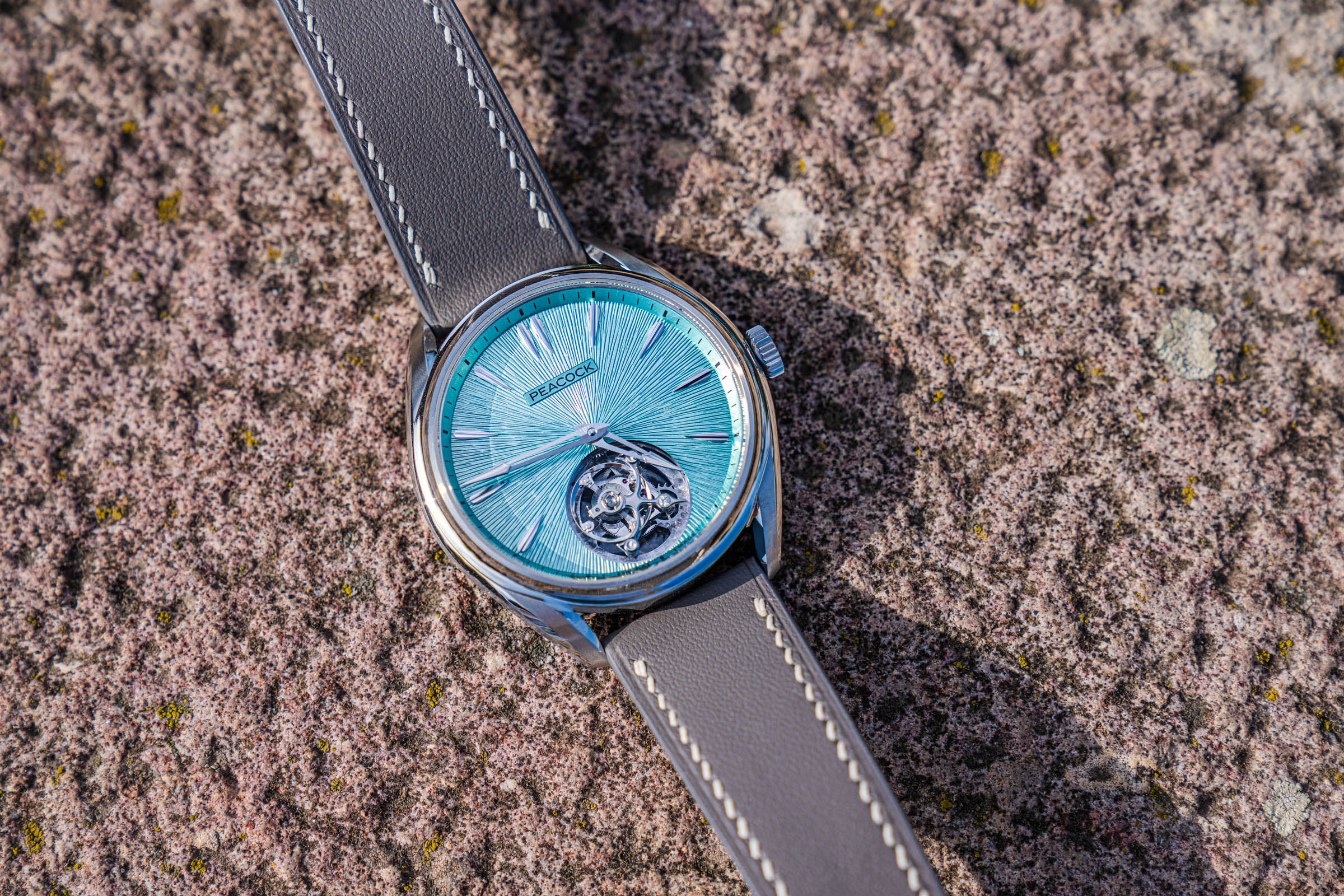
Each hand is hollowed on two surfaces and split by contrasting brushing, in a treatment Peacock describes as yin and yang. The tips then finish in a polished dome, which keeps them legible against the busy dial texture.
The markers follow similar logic. Every index is chiseled on four sides, with brushed flanks framing a recessed core. That recess catches shadow, so the markers read as three-dimensional objects rather than applied batons. Under the sun at Kalemegdan they picked up a warm rose tone against the cool green field.
The strap is premium fine-grain calfskin, reinforced with hand-stitched waxed threading. Waxed thread locks the fibers in place, improves durability, and ages more gracefully than machine stitching. Mine reads grey in shade and slightly warmer in direct light, which suits a dial that behaves the same way.

PEACOCK DIVINE CRAFT: CASE, PROPORTIONS & WRIST FEEL
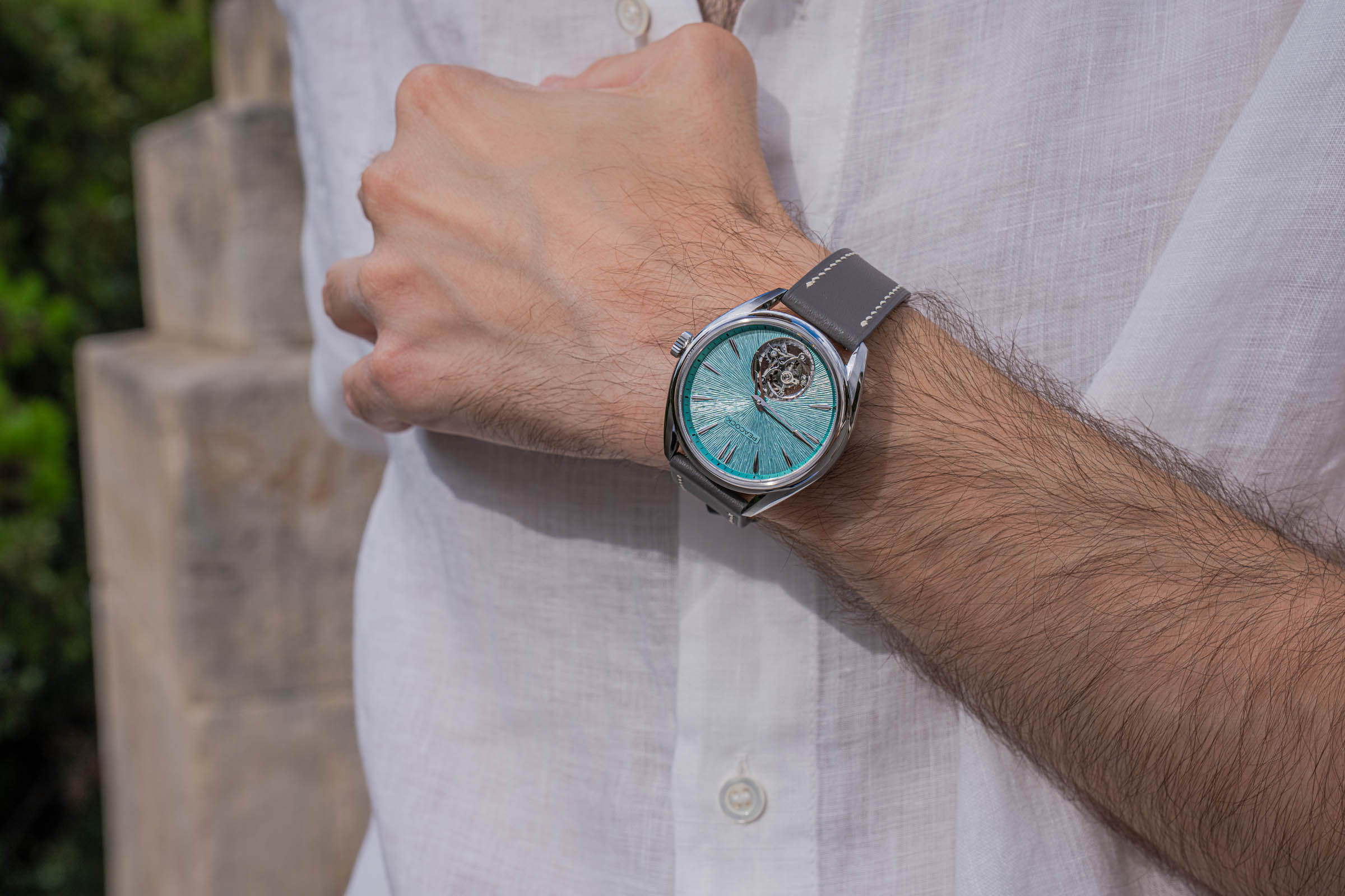
The case is machined from 904L stainless steel, more corrosion-resistant than the common 316L and noticeably whiter when polished. It measures 39.5 mm across and only 8.9 mm thick, with 5 ATM of water resistance.
Peacock calls the construction “Wrapped Vision,” built through a multi-zone process so each surface behaves differently. The edges and inner lugs take a mirror polish. The upper and lower case surfaces receive fine brushing instead, which adds tactile contrast and hides scratches.
A recessed inner bezel then pulls the visual diameter closer to 38 mm. In person, therefore, the watch wears smaller than the specification suggests. Six structural screws secure the caseback directly to the bezel.
For comparison, Peacock’s previous Classic-Grandeur Tourbillon measured 43 mm. Dropping to 39.5 mm while keeping a display caseback represents genuine engineering progress, not marketing.

PEACOCK: FROM DANDONG TO HAUTE HORLOGERIE
The roots of Peacock run deeper than most people outside China realize. In late 1957, seven technical workers at the Andong Metal Products Factory in Dandong, Liaoning, built their first four watches using homemade equipment.
The factory grew steadily through the following decades. It developed its first independently designed movement in 1970, and introduced the Peacock brand name in 1978. By the mid-1980s it employed twelve thousand people.
Knowing that history changes how the Peacock Divine Craft feels on the wrist. A hand-chased tourbillon from Dandong is not an obvious outcome of that story, and I find that genuinely moving.


LINDA FARROW SUNGLASSES: GOLD ON JAPANESE TITANIUM
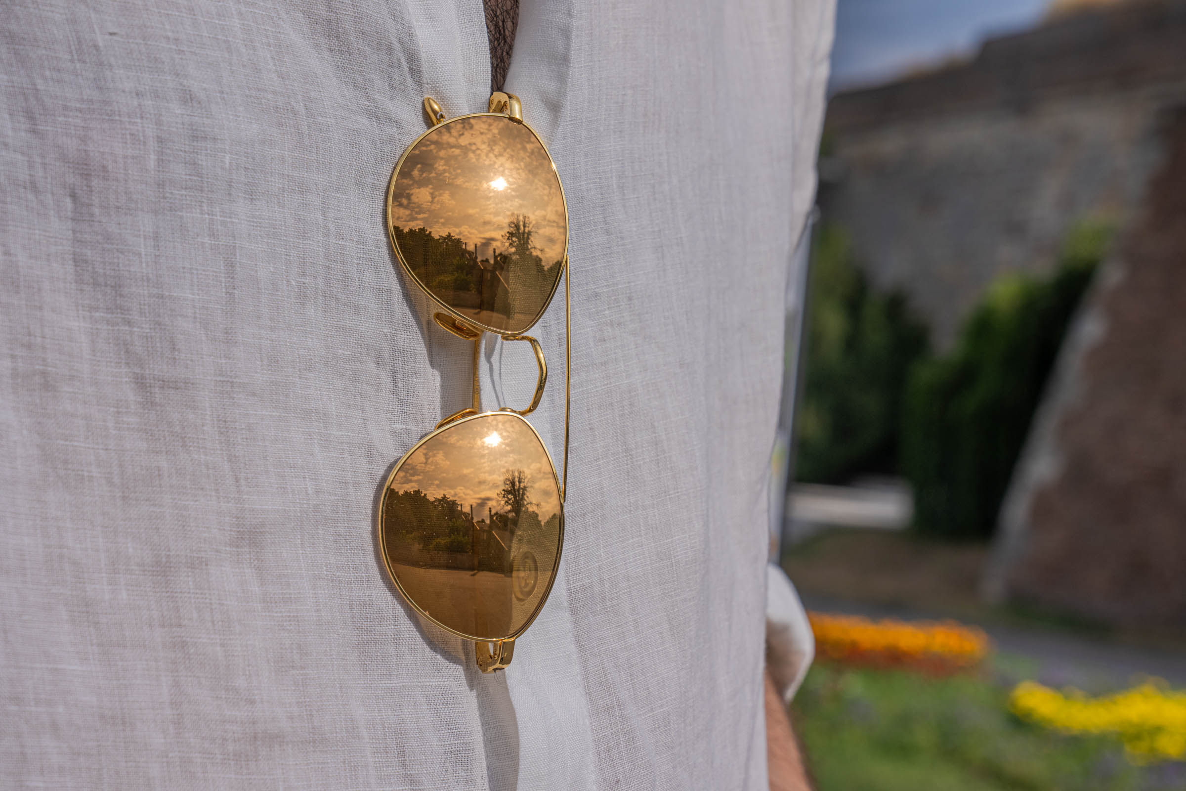
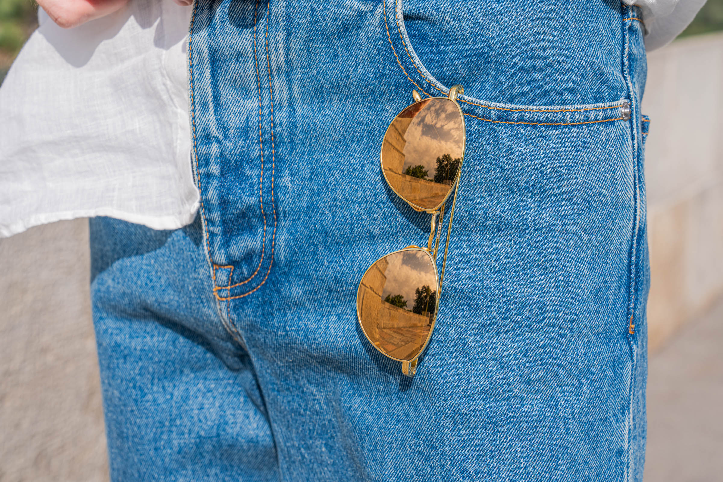
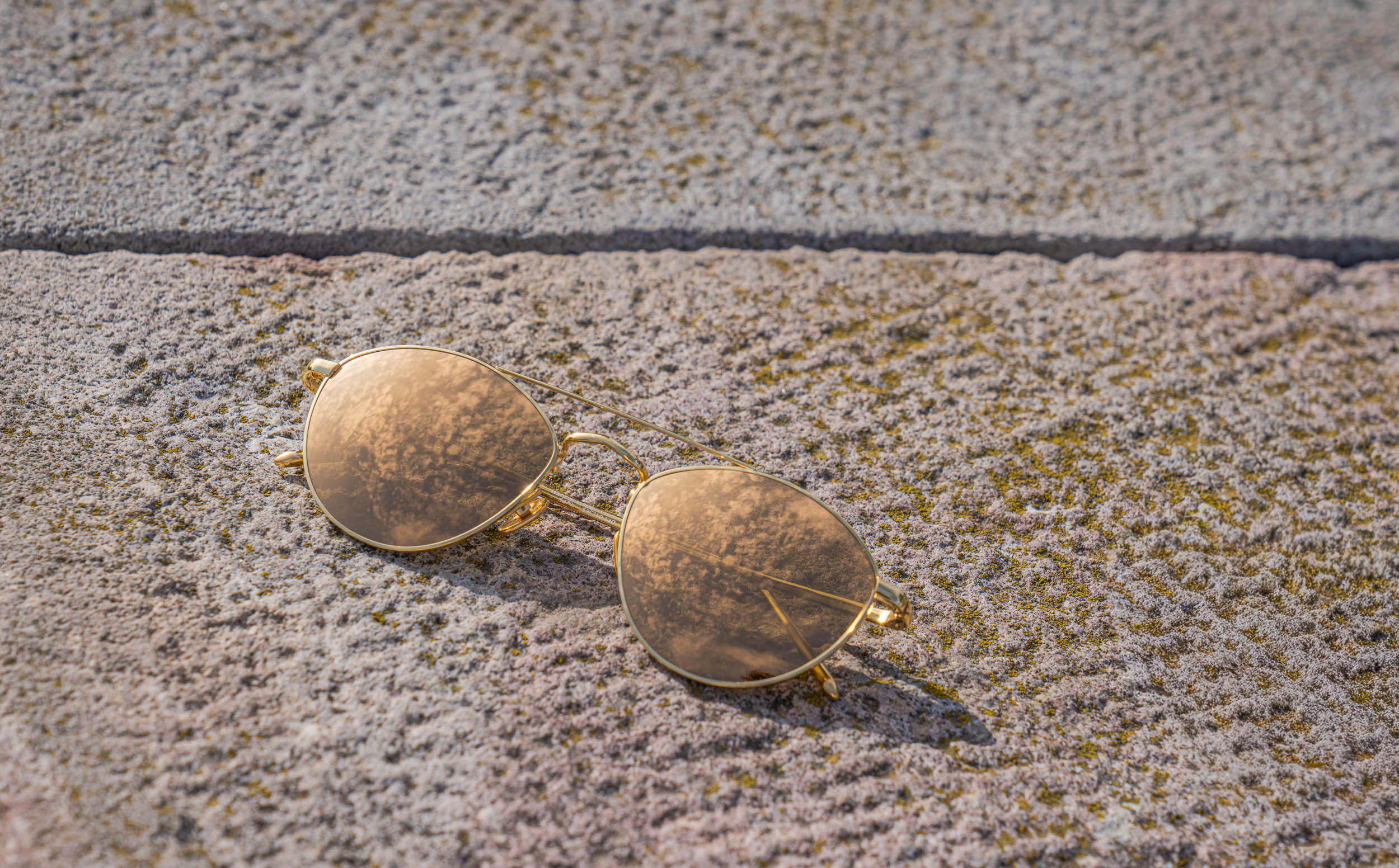
The sunglasses are Linda Farrow, and they do a specific job in this look. Thin gold frames and mirrored amber lenses introduce the only warm tone in the entire outfit. Without them, the palette would run slightly cold.
The shape sits between a panto and an aviator. Rounded lenses, a slim double bridge, and wire temples so fine they almost disappear in profile. Notice how much sky the mirrored lenses pick up across these photographs. On the stone steps they hold an entire cloud bank, which is exactly what a gold mirror coating is supposed to do.

LINDA FARROW: LONDON, 1970
Linda Farrow founded her label in London in 1970. She had trained as a fashion designer, not an optician, and that background shaped everything that followed. Farrow was among the first people anywhere to treat sunglasses as a fashion object rather than a functional one.
Her timing was remarkable. Through the seventies and eighties she produced eyewear for Balenciaga, Yves Saint Laurent and Pucci, at a point when designer houses had no eyewear licensing partners at all. She essentially invented the category those licences now occupy.
Production stopped in the nineties, and the name went quiet for roughly two decades. Then in 2003, her son Simon Jablon went to sort out the family warehouse and found thousands of pairs of original frames still boxed. He was 24.
Jablon relaunched the archive as Linda Farrow Vintage, and Browns and Harvey Nichols placed orders almost immediately. Today he runs the company as creative director and chief executive.
LINDA FARROW: WHY THE MATERIALS MATTER
Linda Farrow builds in Japan, and the specification explains the weight in your hand.
Frames use pure Japanese titanium, plated in 18 to 22 carat gold. Titanium delivers strength at roughly half the density of steel, so a frame this fine still resists bending. Moreover, it does not corrode from skin contact, which matters enormously in summer.
The gold plating is the second half of that equation. Thicker carat plating keeps its color far longer than standard flash gold, and it develops a softer sheen rather than wearing through to base metal.
Adjustable titanium nose pads finish the fit. Consequently, these sit level on my face all day, which cheap wire frames never manage.

BELGRADE FORTRESS: THE PERFECT BACKDROP
We shot everything at Kalemegdan, on the ridge where the Sava meets the Danube. My photographer and I have worked this location before, yet it keeps offering new angles.
The stone lion on its plinth gave us the first sequence. Warm limestone against optic white linen produces a natural contrast that no studio setup replicates convincingly.
From there we moved to the arched belvedere, where New Belgrade rises across the water. Glass towers behind nineteenth-century balustrades create exactly the kind of tension I like in an editorial: old structure, modern city, contemporary clothes.
The grand staircase closed the morning. Long horizontal treads make an excellent frame for a full-length silhouette and the low September light came in from the side rather than overhead. Consequently, the linen picked up texture instead of blowing out to flat white.

HOW TO RECREATE THIS VALENTINO LOOK YOURSELF
You do not need these exact pieces, and I would never suggest otherwise. However, the principles transfer cleanly. Begin with the shirt. Buy real linen, ideally in a lighter weight, and size it so the shoulder seam drops slightly. Wear it open over a plain white tee if the transparency feels like too much.
Choose denim in a mid-blue wash with a straight leg and a mid rise. Avoid black denim entirely in summer, because it absorbs heat and flattens the whole palette. Length should break just once over the shoe, never twice.
For footwear, pick white leather with genuine texture. Woven, grained or lightly perforated uppers all photograph better than flat calf, and they hide scuffs more forgivingly.
Then add exactly one metallic element. Sunglasses, a watch, or hardware on the trousers. Two competing metals will fight; one will read as deliberate. Finally, iron nothing on the day itself. Hang the shirt in a steamy bathroom for ten minutes and let it fall naturally. Perfectly pressed linen defeats the entire purpose of the fabric.

VALENTINO: THE FINAL WORD
I keep returning to how little this Valentino summer outfit actually asks of the wearer. Three colors, four garments, one watch. Nothing complicated, nothing that requires explanation at the door.
Yet the details hold up under close inspection, which is the only standard that really matters. The linen has weight and translucency. The hem hardware has genuine heft. The dial holds over a thousand marks left by a human hand, and the caseback hides several hundred more that nobody will ever see.
That combination, ordinary at a glance and extraordinary up close, is the version of luxury I have come to prefer. Loud clothing gets noticed once. Considered clothing gets remembered.
Thank you for reading and my thanks to Valentino, Linda Farrow and Peacock Watches for making this story possible.
I put a lot of care into this one. The research alone took longer than usual, partly because all three houses in this story deserve more than a caption, and partly because I wanted to get every detail right rather than close enough. If you reached this paragraph, thank you for staying with me.
Tell me what you think in the comments below. I read all of them. I am especially curious whether the watch people and the fashion people land in the same place on this look, because those two audiences rarely agree with each other.
You can also reach me by e-mail or through social networks, all listed on the CONTACT page.
Until the next fashion adventure on the Mr.M blog.
With Love,
Mr.M

This post is sponsored by Maison Valentino, Peacock Watches and Linda Farrow. This post is my personal and honest product review.

Hi Marko, I have been following your fashion stories for quite a while, and what I enjoyed most here was the fact that you did not arrive at this combination immediately. The part about spending almost three weeks taking pieces in and out of the wardrobe actually felt very familiar to me. I have done exactly the same thing before travelling, especially when I know I will be photographed and suddenly become much more critical of proportions than I normally am. The Valentino shirt is a particularly good example because an oversized linen shirt can look wonderful or simply look two sizes too big. Your explanation about the shoulder, cuff and hem gives a much more useful way of judging it. I also own a few linen shirts and have finally accepted the wrinkles rather than fighting them. Do you think this particular shirt would work just as well with cream trousers for an evening version?
Hej Marko, jag fastnade direkt för hur du har byggt hela looken kring väldigt få färger. Vitt, mellanblått och den där mycket ljusa gröna tonen från Peacock-klockan låter enkelt, men bilderna visar att materialen gör större skillnad än färgerna. Jag har själv en ganska omfattande samling skjortor i linne och märker alltid att de bästa ser bättre ut efter några timmars användning än när de precis kommer från kemtvätten. Därför håller jag helt med dig om att man inte ska försöka eliminera varje veck. Valentino-jeansen är också intressanta eftersom själva modellen är så klassisk och detaljerna sitter längst ner. Jag tycker faktiskt att det gör dem lättare att bära än ett par jeans där hela benet är täckt av dekorationer. Hur känns de när man går mycket, Marko? Blir metallringen runt fållen märkbar efter några timmar eller tänker man inte alls på den?
Bonjour Marko, j’ai particulièrement aimé votre manière de parler du volume parce que c’est un problème que je rencontre souvent lorsque j’achète des vêtements italiens. Je mesure toujours la taille d’un vêtement avant de l’essayer, mais cela ne garantit absolument pas que la silhouette sera correcte. Une chemise très large peut rapidement devenir informe si l’épaule tombe trop bas ou si les manches perdent leur structure. Vos trois points de contrôle sont donc beaucoup plus utiles que le simple conseil de prendre une taille supplémentaire. Je possède une vieille chemise en lin blanc que je porte principalement en vacances, mais je n’avais jamais pensé à la transparence du tissu comme vous le décrivez ici. Avec la lumière de Kalemegdan, on comprend vraiment pourquoi cette caractéristique devient intéressante plutôt que problématique. Pensez-vous que vous porteriez cette chemise complètement ouverte sur un simple t-shirt blanc pendant une journée encore plus chaude?
Hola Marko, me ha gustado mucho que este conjunto no dependa de una sola pieza espectacular. Tengo varios vaqueros de corte recto y normalmente los combino con prendas bastante más ajustadas porque siempre he pensado que una camisa amplia encima podía hacerme perder toda la estructura. Después de ver tus fotografías, estoy reconsiderando esa regla. La proporción entre la camisa larga y el denim más lleno parece mucho más equilibrada de lo que imaginaba, especialmente porque el bajo del pantalón dirige la mirada hacia las zapatillas. También me parece muy acertado que las zapatillas sean blancas y no tengan un gran logo visible. El cuero trenzado introduce suficiente textura sin añadir otro elemento llamativo. Y el Peacock, con ese verde tan frío, termina funcionando casi como una pequeña nota de color. ¿Crees que este mismo principio funcionaría con una camisa de lino azul muy pálido?
Hei Marko, jeg likte spesielt avsnittet om hvordan du faktisk bruker klærne i varmen. Mange moteartikler beskriver sommerklær som om de bare skal se bra ut på et fotografi, men man merker fort forskjellen når man går rundt i byen i flere timer. Jeg har flere linskjorter selv, og den største forskjellen jeg opplever mellom en god og en middelmådig skjorte er ikke nødvendigvis utseendet, men hvordan den beveger seg når kroppen blir varm. Derfor var beskrivelsen av de to åpningene på sidene interessant for meg. Jeg liker også at du ikke prøver å skjule at lin krøller seg. Det er nettopp derfor jeg bruker materialet. Kalemegdan virker dessuten som et perfekt sted for denne typen stoff, fordi steinen og lyset gjør teksturen synlig. Brukte du skjorten gjennom hele fotograferingen uten å bytte den?
Ciao Marko, una delle cose che apprezzo maggiormente nei tuoi articoli è quando riesci a spiegare perché un capo funziona invece di limitarti a dire che è bello. Qui il punto delle proporzioni è particolarmente riuscito. Una camicia lunga e larga con un jeans altrettanto pieno può diventare facilmente un errore, mentre nel tuo caso la linea rimane molto pulita. Possiedo alcuni capi Valentino, soprattutto accessori, ma questo denim mi ha incuriosito più di quanto pensassi. Il taglio è abbastanza tradizionale da poter essere indossato spesso, mentre gli occhielli e le borchie sul fondo gli danno una personalità diversa. Mi piace anche il piccolo “Chez Valentino” sul retro perché non sembra un tentativo di mettere il nome del marchio dappertutto. Hai già provato questi jeans con una camicia più corta o preferisci mantenere proprio questa proporzione allungata?
Marko, the watch section was what kept me reading long after I had already decided that I liked the outfit. I am interested in mechanical watches, but I admit that I had never looked closely at Peacock before this article. The description of the dial being struck by hand more than a thousand times immediately changed my perception of it. What I find fascinating is that the result does not look “handmade” in the rustic sense; it looks extremely controlled. I have handled a few high-end guilloché watches and know how quickly a tiny inconsistency can change the whole surface. The fact that the dial is only 30 mm across makes the process even more impressive to me. I also like that the green changes depending on the light rather than remaining completely uniform. Did you notice that difference while wearing the watch during the shoot, or did you only appreciate it when you reviewed the photographs?
Beste Marko, ik vond vooral de combinatie van de locatie en de kleding geslaagd. Kalemegdan is natuurlijk een historische plek, maar op de foto’s voelt het niet alsof je de kleding probeert te laten aansluiten bij een bepaald historisch kostuum. Juist de combinatie van oude steen, het water en de moderne stad op de achtergrond maakt het interessant. Ik ben zelf een paar keer in Belgrado geweest en herinner me hoe sterk het licht daar kan veranderen gedurende de dag. Daarom begrijp ik ook waarom je schrijft dat het linnen in direct licht anders wordt weergegeven. De witte kleur had gemakkelijk kunnen overbelichten, maar de structuur blijft zichtbaar. De Valentino-jeans vind ik daarnaast verrassend draagbaar ondanks de studs.
Olá Marko, a parte que mais me chamou a atenção foi a relação entre o branco da camisa e a pedra de Kalemegdan. À primeira vista parece uma escolha muito simples, mas o cenário mostra porque é que o tecido precisa de ter textura para não ficar completamente plano nas fotografias. Tenho algumas camisas de linho portuguesas e aprendi há muito tempo que tentar mantê-las impecavelmente passadas é quase uma batalha perdida. Hoje prefiro aceitar as rugas e concentrar-me no corte e na qualidade do tecido. A tua explicação sobre a camisa oversized também me parece muito prática. Já comprei peças duas vezes acima do meu tamanho pensando que isso criaria volume, e o resultado foi exatamente o contrário do que eu queria. A questão dos ombros e do comprimento faz muito mais sentido. Achas que esta camisa funcionaria com um relógio de ouro ou preferes manter o contraste frio do aço e do verde?
Cześć Marko, najbardziej zainteresował mnie fragment o tym, że spędziłeś prawie trzy tygodnie, zanim uznałeś stylizację za skończoną. To brzmi znacznie bardziej realistycznie niż większość sesji modowych, gdzie wszystko wygląda tak, jakby zostało wybrane w pięć minut. Sam często mam problem z letnimi zestawami, bo przy wysokiej temperaturze trudno dodać coś więcej bez utraty wygody. Biała koszula z lnu jest oczywiście klasykiem, ale szeroki krój sprawia, że nie wygląda jak zwykła koszula wakacyjna. Podoba mi się też, że jeans pozostaje prosty, a metalowe elementy pojawiają się tylko przy nogawkach. Mam kilka par jeansów Valentino, ale żadnej z tej kolekcji. Czy te studs na dole rzeczywiście wpływają na sposób, w jaki spodnie układają się na bucie? Jestem ciekaw, czy różnica jest widoczna również podczas normalnego chodzenia.
Hello Marko, I have to admit that the Valentino denim was the piece I initially liked least when I saw the title, but the more I read, the more I understood why you chose it. I tend to avoid decorated jeans because many of them become dated very quickly. These are different because the basic cut is so conventional: regular fit, straight leg, mid-rise and no artificial wash. The hardware is concentrated at the hem, so the rest of the trouser remains quite quiet. I own a pair of dark Japanese selvedge jeans with almost no decoration, and that has always been my preference, but I could see myself wearing these in summer. The silver-finished studs also make sense with the white leather sneakers. Would you style them differently for an evening dinner, perhaps with a black or charcoal shirt, or would that make the hardware feel too strong?
Hallo Marko, ich fand den historischen Teil über Valentino fast genauso interessant wie die eigentliche Kleidung. Mir war zwar bekannt, dass Valentino Garavani sein Haus in Rom gegründet hat, aber die Verbindung zwischen seiner Ausbildung in Paris und seiner späteren römischen Ästhetik hatte ich bisher nicht so genau betrachtet. Besonders spannend finde ich die Geschichte der „no color“-Kollektion aus den Jahren 1967 und 1968. Gerade weil dein heutiger Look ebenfalls stark auf Weiß, Beige und sehr zurückhaltende Farben setzt, wirkt diese historische Verbindung nicht zufällig. Ich besitze einen alten Valentino-Schal aus einer früheren Zeit und habe ihn gerade wegen dieser reduzierten Farbwelt immer geschätzt. Die heutigen Jeans bringen dann eine modernere Interpretation der Nietenidee hinein. Findest du, dass Alessandro Michele diese historischen Codes aktuell eher zurückhaltend oder bewusst stärker sichtbar macht?
Marko, me ha gustado especialmente la parte dedicada a los detalles metálicos porque siempre he pensado que un buen look masculino necesita algún elemento que rompa la uniformidad. Sin embargo, suelo hacerlo con el reloj y no con la ropa. Tengo varios pantalones con pequeños detalles metálicos, pero normalmente termino dejándolos en el armario porque me parecen demasiado llamativos. Tus vaqueros de Valentino me han hecho cambiar un poco de opinión. Al estar las piezas metálicas únicamente alrededor del bajo, no dominan el conjunto y además crean una transición interesante hacia las zapatillas. También me parece inteligente que el reloj tenga una esfera verde muy clara en lugar de otro elemento metálico evidente. Eso mantiene el conjunto bastante tranquilo. Si tuvieras que elegir entre las gafas Linda Farrow y el reloj como único detalle especial, ¿cuál mantendrías?
Hej Marko, jag uppskattade verkligen delen om att linneskjortan inte behöver vara perfekt slät. Jag har arbetat i miljöer där man förväntas se mycket välklädd ut även under sommaren, och jag har därför försökt stryka mina linneskjortor alldeles för mycket. Resultatet har ofta blivit att de ser fina ut i tio minuter och sedan får exakt samma veck igen. Det du skriver om att låta materialet vara sig självt känns mycket mer logiskt. Jag tycker också att Valentino har lyckats bra med längden på skjortan. Den är tydligt oversized, men den når inte så långt att proportionerna blir konstiga. Kalemegdan är dessutom ett fantastiskt bakgrundsval eftersom stenens varma ton ger lite kontrast till det optiskt vita tyget. Hur upplevde du skjortan efter en hel morgon i solen?
Marko, j’ai beaucoup aimé votre remarque selon laquelle le volume doit être intentionnel. C’est probablement l’une des erreurs que je vois le plus souvent chez les hommes qui commencent à porter des vêtements plus amples. Ils prennent simplement une ou deux tailles supplémentaires et pensent obtenir une silhouette contemporaine. En réalité, la longueur de l’épaule, du poignet et de l’ourlet change complètement le résultat. Je possède une chemise blanche en lin assez large d’une maison italienne et j’ai dû la faire légèrement retoucher parce que les manches étaient trop longues. Depuis, je regarde beaucoup plus attentivement ces trois points avant d’acheter. Votre chemise Valentino me paraît particulièrement bien proportionnée. Et les deux fentes latérales semblent vraiment utiles pour éviter que le tissu ne s’accumule autour des hanches. Est-ce une caractéristique que vous recherchez maintenant systématiquement dans vos chemises d’été?
I have been interested in watches for years, so the PAX9610A section was probably the part I read most carefully. A 3.5 mm hand-wound flying tourbillon with a 68-hour power reserve is already interesting, but what caught my attention was the finishing underneath the dial. I particularly liked your explanation of the internal angles because that is one of those details collectors talk about without always explaining why it matters. I have owned watches with beautiful casebacks that looked impressive but did not really change my understanding of the movement. Here, the combination of perlage, Geneva stripes and hand-polished angles seems much more deliberate. The little diamond on the tourbillon cage is also a charming touch. Did the watch feel noticeably different on the wrist because of the 39.5 mm case compared with the previous 43 mm Peacock you mention?
Ciao Marko, la parte che mi ha colpito maggiormente è stata quella dedicata alla storia di Peacock. Conosco abbastanza bene la tradizione dell’orologeria svizzera, ma ammetto di avere sempre saputo molto poco della storia industriale dell’orologeria cinese. Il fatto che la fabbrica di Dandong sia nata alla fine degli anni Cinquanta con sette tecnici e attrezzature costruite in casa rende il percorso verso un tourbillon di questo livello davvero particolare. Non significa automaticamente che un prodotto sia migliore o peggiore, ma sicuramente cambia il modo in cui lo si guarda. Mi piace anche che tu abbia raccontato questa storia senza cercare di trasformarla in una gara tra scuole orologiere. Il risultato finale è molto più interessante proprio per questo. Hai avuto modo di visitare personalmente Dandong oppure tutta la ricerca sulla storia di Peacock è stata fatta per questo articolo?
Marko, the Linda Farrow section was one of those parts I did not expect to spend so much time reading. I knew the name, of course, but I had never realised how early the brand treated sunglasses as a fashion category rather than simply an optical product. The story of Simon Jablon finding thousands of original frames in the family warehouse is particularly fascinating. I also appreciate why you chose this specific pair for the outfit. The thin gold frame introduces warmth without competing with the green watch or the silver details on the denim. I own a pair of Japanese titanium glasses and the weight difference compared with ordinary metal frames is immediately noticeable, especially after wearing them all day. Did these Linda Farrow frames feel similarly light to you, or is the main advantage really the flexibility and resistance of the titanium?
Hei Marko, jeg likte veldig godt delen om Kalemegdan fordi stedet faktisk blir en del av historien og ikke bare en tilfeldig bakgrunn. Den varme steinen mot den hvite linskjorten fungerer spesielt godt på bildene. Jeg har fotografert noen egne antrekk på reise, og jeg vet hvor vanskelig hvite klær kan være når solen står høyt. Alt kan lett bli helt flatt, og man mister teksturen. Derfor var det interessant å lese at dere valgte den store trappen mot slutten av morgenen, da lyset kom fra siden. Det forklarer mye av forskjellen mellom bildene. Jeg liker også kontrasten mellom de historiske strukturene og New Belgrade i bakgrunnen. Det gir antrekket en følelse av å være både klassisk og moderne. Var trappen faktisk ditt førstevalg, eller fant dere den vinkelen først da dere begynte å fotografere?
I own several white linen shirts, and the one thing I have learned over the years is that the fabric tells you very quickly whether the cut is right. A beautifully woven linen shirt can still look terrible if it hangs too close to the body. That is why I found your sizing advice more useful than the usual “go oversized” recommendation. The detail about the cuff still needing to close properly is particularly good because it is something I had never consciously considered. I also like the way you have paired the shirt with straight rather than extremely wide jeans. It keeps the volume controlled. The woven Valentino sneakers then add texture without introducing another colour. I am tempted to try the same formula with my own white linen shirt this summer. Would you personally wear a white T-shirt underneath this particular shirt, or do you think the transparency is part of its character?
Marko, bardzo spodobał mi się fragment o tym, że ubrania powinny być wygodne nawet wtedy, kiedy wyglądają luksusowo. Sam kiedyś kupowałem rzeczy głównie na podstawie tego, jak wyglądały przed lustrem, a dopiero później odkrywałem, że nie chcę ich nosić przez cały dzień. Szczególnie dotyczyło to butów i marynarek. Dlatego zdanie o przejściu przez nierówny kamień na Kalemegdanie jest dla mnie bardziej przekonujące niż zwykłe stwierdzenie, że coś jest wygodne. Białe sneakersy Valentino mają przy tym ciekawą plecioną skórę, która odróżnia je od setek podobnych modeli. Podoba mi się również informacja, że kurz należy usuwać miękką szczotką, a nie zwykłą szmatką. Mam pytanie: czy po kilku miesiącach użytkowania rzeczywiście widać na tej plecionej skórze taką miękką patynę, o której piszesz?
Marko, terminé el artículo pensando que el verdadero tema era mucho más amplio que una combinación de Valentino y un reloj poco conocido. Hay una idea constante sobre elegir objetos que tengan suficiente calidad para acompañarte durante años y que, al mismo tiempo, puedan integrarse en la vida real. Me gustó especialmente que las fotografías se hicieran en Kalemegdan y no en un escenario de lujo demasiado evidente. La piedra, el encuentro del Sava y el Danubio y los edificios modernos de New Belgrade hacen que la ropa parezca parte de la ciudad y no simplemente un conjunto colocado delante de una cámara. También me parece interesante que el Peacock aporte una historia completamente diferente, desde Dandong hasta la micro-técnica del dial. Tengo que preguntarte algo que probablemente dividirá a tus lectores: si tuvieras que conservar solamente una pieza de todo el conjunto, ¿elegirías la camisa Valentino, los jeans o el Peacock?
Marko, I particularly liked the way you described the difference between a luxury item that gets noticed once and one that becomes memorable. I think that applies especially well to the Valentino shirt. There is nothing spectacular about a white linen shirt at first glance, yet the details you explain make this one quite different from an ordinary summer shirt. The same is true of the jeans. Someone walking past would probably see straight blue denim, while someone standing closer would notice the entire line of silver-finished eyelets and domed studs. The Peacock works on an even deeper level because most of its craftsmanship is invisible unless the owner turns the watch over. I have always preferred that kind of quiet discovery. After all the research you did for this story, which individual piece surprised you most once you had actually spent time with it?
Caro Marko, la parte che ho trovato più personale è quella in cui dici che ormai il vero test di un capo è poterlo indossare senza controllare continuamente la propria immagine. Condivido molto questa idea. Ho acquistato negli anni alcuni pezzi bellissimi che però mi facevano sentire sempre troppo vestito o troppo rigido, e alla fine sono rimasti nell’armadio. Al contrario, le cose che uso di più sono spesso quelle che quasi dimentico di avere addosso. La tua combinazione Valentino sembra funzionare proprio per questo motivo. La camicia è ampia, il jeans è comodo e le sneakers non sembrano progettate soltanto per essere fotografate. Anche il Peacock, nonostante la complessità tecnica, ha una cassa relativamente contenuta. Secondo te questa attenzione al comfort è diventata più importante nel tuo modo di vestire rispetto a qualche anno fa?
Marko, ich fand die Erklärung zum Armband des Peacock besonders interessant. Bei einem so aufwendig gearbeiteten Zifferblatt hätte ich wahrscheinlich automatisch eine sehr auffällige oder farblich passende Lösung erwartet. Stattdessen ist das Armband relativ ruhig und aus feinem Kalbsleder mit handgenähtem Wachsfaden gefertigt. Gerade dadurch bleibt das Zifferblatt der Mittelpunkt, ohne dass die Uhr insgesamt langweilig wirkt. Ich habe bei meinen eigenen Uhren schon erlebt, wie stark ein anderes Armband die Wahrnehmung derselben Uhr verändern kann. Eine eher sportliche Uhr wirkt plötzlich klassischer, während ein eleganter Zeitmesser mit einem falschen Lederband schnell beliebig aussieht. Dass das graue Leder im Schatten etwas wärmer erscheint, finde ich ebenfalls interessant. Würdest du für dieses Peacock irgendwann ein zweites Armband in einer anderen Farbe ausprobieren oder würdest du es genau so lassen?
Marko, I have to say that the more I looked at the photographs, the more I appreciated the restraint of the outfit. At first I noticed the watch because it is unusual, then the studs on the Valentino jeans, but after reading the article I realised how much of the look depends on things that are almost invisible. The cut of the shirt, the weight of the linen, the exact length of the jeans and the texture of the sneakers are doing most of the work. I have become increasingly interested in that kind of dressing because it gives you more freedom. You can replace one expensive piece with something simpler without destroying the whole idea. Your final styling advice is therefore probably more useful to me than the shopping list itself. If you had to keep only one principle from this entire outfit for a man building his wardrobe, would you choose proportion, texture or the restricted colour palette?
Marko, j’ai particulièrement aimé les photographies prises devant le belvédère parce qu’elles montrent exactement ce que vous décrivez dans le texte: une structure ancienne, une ville moderne et une tenue contemporaine dans la même image. Je trouve que ce type de contraste fonctionne beaucoup mieux qu’un décor entièrement luxueux. Les tours de New Belgrade derrière les balustrades donnent une échelle intéressante à la silhouette. La chemise blanche aurait pu paraître presque trop simple dans un studio, alors qu’ici elle devient très graphique. J’aime aussi la façon dont les lunettes Linda Farrow introduisent une petite quantité de doré sans transformer la palette. Je possède des lunettes à monture dorée assez similaire, mais avec des verres beaucoup plus sombres, et elles sont beaucoup plus difficiles à intégrer dans mes vêtements. Les verres ambrés de votre modèle vous semblent-ils plus faciles à porter au quotidien?
Marko, a parte sobre Dandong foi provavelmente a maior surpresa do artigo para mim. Trabalho há muitos anos com produtos industriais e tenho muito respeito por empresas que conseguem evoluir tecnicamente durante décadas em vez de simplesmente mudar de imagem. A história dos sete trabalhadores que construíram os primeiros relógios em 1957 com equipamento feito por eles próprios é muito diferente da imagem que normalmente temos quando pensamos em alta relojoaria. O mais interessante é que essa história acaba por chegar a um tourbillon ultrafino de 3,5 mm com um movimento bastante sofisticado. Não esperava encontrar uma narrativa destas num artigo que começa com uma camisa branca Valentino. É precisamente essa mistura que torna o texto interessante. A minha pergunta é mais pessoal: depois de pesquisar tanto sobre a história da Peacock para este artigo, mudou a tua percepção da marca ou o relógio já te tinha conquistado antes dessa pesquisa?
What I found most convincing about this outfit is that every material is doing a different job. The linen keeps the shirt light and breathable, the cotton denim gives the lower half some structure, the woven leather sneakers add surface interest and the watch introduces a completely different kind of craftsmanship. I have always preferred outfits built this way because texture can create depth without requiring lots of colours. My own summer wardrobe is mostly navy, white, beige and light blue for exactly that reason. The one thing I had not tried before was woven white leather footwear. I normally buy smooth leather because I assume it is easier to maintain, but your explanation about using a soft brush has made me reconsider that. Do you think woven leather actually hides small scuffs better than smooth white leather, or does the texture simply make them less noticeable?
Bonjour Marko, j’ai beaucoup aimé votre passage sur la mort de Valentino Garavani et la manière dont vous avez choisi de porter la maison quelques mois après sa disparition. Je pense que les vêtements peuvent effectivement conserver une mémoire, surtout lorsqu’ils sont associés à une période ou à une personne. J’ai moi-même quelques pièces d’archives italiennes que je porte différemment aujourd’hui parce que je connais mieux leur histoire qu’au moment où je les ai achetées. Le fait que Valentino ait travaillé entre Paris et Rome explique aussi pourquoi la maison possède cette combinaison particulière de rigueur et de théâtralité. Votre tenue est évidemment beaucoup plus discrète, mais je retrouve cette idée dans les proportions et les détails métalliques. Je trouve assez émouvant que le shooting ait eu lieu seulement quelques mois après janvier 2026. Est-ce que cette dimension historique a influencé votre choix de porter précisément Valentino pour cette histoire?
I have been buying luxury menswear for long enough to realise that the pieces I return to most are rarely the ones that looked most impressive in the shop. They are usually the ones that make sense with the rest of my wardrobe. That is why I found your recreation advice at the end particularly useful. The idea of starting with lightweight real linen, then choosing mid-blue straight denim and textured white leather shoes is much easier to apply than simply copying the exact Valentino outfit. I especially like your recommendation to avoid black denim in summer because it absorbs heat and changes the whole palette. I made that mistake for years and always wondered why my summer outfits felt heavier than they looked. The single metallic element is another rule I can actually use. Do you follow that principle even when wearing jewellery, or are you mainly talking about watches, sunglasses and clothing hardware?
Hei Marko, jeg liker spesielt godt hvordan du beskriver forskjellen mellom volum som er planlagt og volum som bare skyldes feil størrelse. Jeg har selv gjort akkurat den feilen med en hvit linskjorte. På hengeren så den perfekt ut, men da jeg tok den på, falt skulderen nesten ned på overarmen og hele plagget så lånt ut. Etter det har jeg blitt mye mer opptatt av hvor skuldersømmen faktisk ligger. Derfor var de tre punktene dine overraskende nyttige. Jeg synes også at det er interessant at du bruker en relativt tradisjonell jeans sammen med den store skjorten. Det gjør at antrekket fortsatt ser kontrollert ut. De hvite sneakersene hjelper selvfølgelig også. Ville du brukt akkurat samme størrelse på skjorten dersom du skulle ha den under en lett jakke, eller ville du gått litt mindre for å unngå for mye stoff?
Marko, I really enjoyed the part about the watch being made for the owner and the watchmaker rather than for somebody sitting across the table. That is a very different philosophy from the way luxury is often marketed today. I have owned watches where the caseback was almost more important to me than the dial because I knew the finishing was there even when nobody else could see it. The Peacock seems to take that idea seriously, particularly with the “Peacock Eye” screws and the repeated attempts to develop a screwdriver strong enough to work with them. That little story tells me more about the seriousness of the finishing than another page of adjectives ever could. I also appreciate the relatively modest 39.5 mm size. Would you consider this proportion one of the main reasons the watch works so naturally with the oversized Valentino silhouette?
Marko, je trouve votre choix des jeans particulièrement intelligent parce que vous avez résisté à la tentation de multiplier les éléments de mode. Le pantalon possède une coupe très classique, sans délavage artificiel, sans déchirures et sans silhouette extrême. Toute la personnalité vient finalement de la bande métallique autour de l’ouverture. Je possède plusieurs jeans très décorés que je porte beaucoup moins que prévu parce qu’ils imposent immédiatement le reste de la tenue. Ici, je pense que c’est l’inverse. On peut conserver une chemise blanche très simple et laisser les détails apparaître seulement lorsque quelqu’un regarde de plus près. C’est une approche que je préfère nettement. Est-ce que tu as volontairement choisi un denim aussi classique parce que tu savais que le reste de la tenue, notamment la montre et les lunettes, apporterait déjà suffisamment de détails?
Ciao Marko, mi è piaciuto molto il modo in cui hai inserito il Peacock nell’outfit senza farlo diventare il protagonista assoluto. È un errore che vedo spesso nelle fotografie di orologi: appena compare un tourbillon, tutto il resto sembra costruito soltanto per mettere in evidenza l’orologio. Qui invece la camicia, il denim e le sneakers hanno una loro identità e il Peacock aggiunge semplicemente un altro livello. Trovo molto interessante anche il colore glacial green, soprattutto perché cambia abbastanza con la luce. Ho una vecchia giacca verde molto chiara che sembra quasi grigia all’ombra e molto più intensa al sole, quindi capisco perfettamente cosa intendi quando descrivi questo effetto. Le fotografie scattate a Kalemegdan sembrano mostrare bene entrambe le versioni. Quale delle due tonalità preferisci personalmente: il verde quasi ghiacciato in ombra o quello più intenso sotto il sole?
Marko, bardzo spodobało mi się zdanie, że głośne ubrania zostają zauważone raz, a przemyślane są zapamiętywane. Mam podobne doświadczenie z zegarkami. Kiedyś wybierałem modele, które od razu rzucały się w oczy, a z czasem zacząłem bardziej doceniać te, które mają coś ciekawego dopiero przy bliższym spojrzeniu. Peacock jest dokładnie takim przykładem. Na nadgarstku widać przede wszystkim bardzo spokojny zielony kolor i niewielką kopertę, ale dopiero opis mechanizmu pokazuje, ile pracy znajduje się pod spodem. Szczególnie ciekawi mnie 904L stal, ponieważ najczęściej mówi się o niej w kontekście innych dużych marek zegarkowych. Czy w praktyce naprawdę zauważasz różnicę w wyglądzie polerowanych powierzchni w porównaniu ze stalą 316L?
The Linda Farrow story was a genuine discovery for me. I knew the frames were made in Japan and that the brand had a strong fashion heritage, but I had never heard the story about Simon Jablon finding thousands of original frames in the family warehouse. That is almost too perfect a story for a fashion archive. I also think the choice of gold titanium makes sense with this particular outfit because there is otherwise very little warmth above the waist. The amber mirrored lenses then pick up the light without becoming another loud colour. I have worn titanium frames for years and would never willingly go back to heavy steel ones, especially during summer. The adjustable nose pads are another small detail that makes a difference when you wear sunglasses for hours. Did you choose the Linda Farrow pair primarily for the shape, or was the Japanese titanium equally important to you?
Marko, votre réflexion sur le fait qu’un vêtement doit fonctionner dans la vraie vie m’a particulièrement parlé. Je voyage beaucoup pour mon travail et je suis devenu beaucoup plus exigeant sur ce point. Une tenue peut être parfaite pour une photographie et devenir pénible après trois heures de marche. Ici, le choix d’une chemise en lin ample, d’un denim droit et de sneakers en cuir me paraît beaucoup plus cohérent avec une vraie journée à Belgrade. J’aime également votre décision de garder le nombre de couleurs très limité. Lorsque je voyage, j’essaie moi aussi de construire mes tenues autour de trois ou quatre couleurs afin de pouvoir mélanger les pièces sans réfléchir chaque matin. Le seul élément qui me pose encore question est la transparence du lin blanc. Porteriez-vous toujours un t-shirt blanc dessous si vous deviez passer une journée entière en ville, ou est-ce que cela enlèverait une partie du caractère de cette chemise?
I have always been more interested in watches when the finishing is something you can discover rather than something that is immediately visible from across a room. That is why the Peacock caseback caught my attention. The combination of hand-finished perlage, circular Geneva stripes and those internal angles sounds much more demanding than simply polishing a case beautifully. I especially appreciated your explanation that internal angles cannot be produced by machine. It gives the collector a concrete reason to care about something that might otherwise sound like another technical term. I own a watch with a very elaborate caseback and often find myself turning it over during meetings simply because there is so much to see. The Peacock seems like the kind of watch that would reward the same habit. Do you find yourself looking at the movement often when you wear it, or do you mostly forget about it once it is on the wrist?
Hej Marko, jeg synes faktisk, at fotografierne ved Kalemegdan er noget af det bedste ved hele historien. Det er ikke kun fordi stedet er smukt, men fordi det giver tøjet en helt anden ramme end de sædvanlige modebilleder fra Milano eller Paris. Jeg har selv været i Beograd og kan godt huske kontrasten mellem den gamle fæstning og udsigten mod den moderne by på den anden side af floden. Derfor fungerer billedet ved belvederen særligt godt for mig. Den hvide skjorte får næsten en anden karakter mod den varme sten, mens det grønne på Peacock-urskiven bliver mere synligt. Jeg kan også godt lide, at I ikke har forsøgt at skjule byens moderne arkitektur i baggrunden. Var der et bestemt billede fra Kalemegdan, hvor du selv med det samme tænkte: “Det er det”?
The story about Professor Zhao Yi was one of the strongest parts of the watch section for me. I have always been fascinated by the point where jewellery, sculpture and watchmaking overlap, and the description of her work makes the Peacock dial much easier to understand. A surface only 30 mm wide with more than a thousand individually struck lines is a completely different proposition from a dial that has simply been decorated by a machine. I also liked that you explained the three different chasing tools rather than just calling the dial “hand engraved”. That distinction matters to anyone who actually cares about craft. The fact that the development took around six months also gives some perspective on why the dial looks so controlled. Did you have a chance to see the dial under magnification in person? I imagine it must look completely different through a loupe.
Marko, ich musste bei deiner Beschreibung der Pflege der weißen Sneakers an meine eigenen Schuhe denken. Ich habe mehrere Paar weiße Ledersneaker und habe früher immer mit einem Tuch gearbeitet, bis ich irgendwann bemerkt habe, dass damit der Staub in den kleinen Strukturen eher verteilt als entfernt wird. Bei gewebtem Leder ist eine weiche Bürste tatsächlich viel logischer. Genau deshalb finde ich die Valentino-Sneaker interessanter als völlig glatte weiße Modelle. Das Korbmuster erzeugt Tiefe, ohne dass zusätzliche Farben nötig sind. Ich mag außerdem den Gedanken, dass sich das Leder durch die unabhängige Bewegung der einzelnen Stränge anders entwickelt. Bei guten Lederschuhen interessiert mich inzwischen fast mehr, wie sie nach zwei Jahren aussehen, als wie sie am ersten Tag aussehen. Hast du vor, diese Sneakers wirklich lange zu tragen und später noch einmal über ihre Patina zu schreiben?
Marko, una de las cosas que más me ha gustado del artículo es que no intentas convencer al lector de que necesita comprar exactamente las mismas piezas. Eso me parece mucho más útil que una historia que simplemente presenta una lista de productos de lujo. Tengo una camisa de lino blanca bastante sencilla y unos vaqueros azul medio que probablemente cuestan una fracción de los Valentino, pero después de leer tus consejos veo que puedo trabajar con los mismos principios. El corte recto, la longitud correcta y una textura interesante en los zapatos ya cambian mucho el resultado. También me ha gustado la regla de utilizar un solo elemento metálico importante. Nunca había pensado que dos metales diferentes pudieran competir visualmente de esa manera. ¿Tú aplicas esa regla también cuando llevas un reloj de acero y gafas con montura dorada, o consideras que esos dos elementos pueden convivir porque están separados?
Hallo Marko, ich habe die Passage über das „Chez Valentino“-Label besonders aufmerksam gelesen. Ich finde es interessant, dass der Schriftzug auf der Rückseite eher wie eine Adresse wirkt als wie ein klassisches Logo. Genau solche Details gefallen mir bei Luxusmode meistens besser als ein großer Markenname auf der Vorderseite. Ich besitze einige ältere italienische Jeans, bei denen die Marke ebenfalls nur sehr klein auf dem Label erscheint, und erstaunlicherweise sind das die Modelle, die ich am häufigsten trage. Bei den Valentino-Jeans finde ich außerdem den geraden Schnitt wichtig. Die Metallteile am Bein wären bei einem sehr engen oder extrem weiten Schnitt wahrscheinlich viel auffälliger. So bleiben sie eher ein Detail, das man erst beim zweiten Blick entdeckt. Würdest du die Jeans auch mit einem komplett schlichten weißen T-Shirt tragen oder wäre das für dich zu wenig Kontrast?
Marko, I particularly enjoyed your final idea that luxury can be ordinary at a glance and extraordinary up close. That is probably the way I prefer to dress now. I have gradually moved away from pieces that announce themselves immediately and towards things where the quality becomes apparent after wearing them for a while. My favourite jacket, for example, has almost no visible branding, but the fabric and construction are exceptional. The Valentino shirt in your story gives me a similar impression. From a distance it is simply a white linen shirt, but then you notice the transparency, the length, the side vents and the way it moves. The Peacock takes that idea even further because almost all of its most impressive work is hidden under the dial or on the caseback. I think that is a much more interesting definition of luxury than simply saying something is expensive. Do you think your own taste has moved in this direction over the years?
Marko, ho trovato molto interessante il collegamento tra i jeans e la storia dei Rockstud. Quando penso a Valentino e alle borchie, immagino immediatamente i classici elementi piramidali degli accessori Rockstud. Qui invece le borchie sono tonde e molto più discrete, ma il principio rimane riconoscibile. Possiedo una vecchia borsa Valentino con Rockstud e trovo interessante come un dettaglio metallico possa diventare parte dell’identità di una maison senza necessariamente dominare l’intero prodotto. Nei tuoi jeans mi piace soprattutto il fatto che il resto del pantalone rimanga estremamente classico. Se fossero stati anche strappati o scoloriti, probabilmente l’effetto sarebbe stato troppo forte. Così invece il dettaglio sul fondo sembra quasi una firma. Hai scelto consapevolmente il denim proprio per questa ragione o hai iniziato dalla camicia e poi hai cercato qualcosa che potesse sostenerla?
Marko, het verhaal over de geschiedenis van Valentino in Rome vond ik verrassend relevant voor deze specifieke outfit. Vaak lees je de geschiedenis van een modehuis als achtergrondinformatie en daarna zie je het nooit meer terug in de kleding. Hier is dat anders. De verwijzing naar de witte collectie uit 1967 en 1968 sluit direct aan bij de optische witte linnen blouse die je draagt. Ook de uitleg over de Rockstuds maakt de metalen details op de jeans begrijpelijker. Ik vind het interessant dat de moderne versie veel rustiger is dan de klassieke Rockstud-accessoires. Zelf heb ik een Valentino-riem met vrij subtiele hardware en juist die draag ik het meest. Een groot logo verveelt mij sneller. Denk je dat deze nieuwe, meer ingetogen benadering van de Valentino-codes ook buiten accessoires goed zal werken?
Bonjour Marko, j’ai particulièrement apprécié votre passage sur les matières parce qu’il rappelle quelque chose que les photos ne montrent pas toujours. Un tissu peut sembler magnifique sur un écran et être complètement différent lorsque vous le touchez ou le portez pendant plusieurs heures. Le lin Valentino a cette transparence que l’on voit très bien sur les photographies, mais vous expliquez aussi pourquoi cette structure est utile dans la chaleur. J’aime également la manière dont le cuir tressé des sneakers apporte une deuxième texture sans introduire une autre couleur. J’ai une paire de chaussures en cuir tressé depuis plusieurs années et je confirme qu’elles vieillissent différemment d’un cuir lisse. Les petites marques se répartissent plutôt que de former une seule grande pliure. Votre conseil de les nettoyer avec une brosse douce me semble donc particulièrement juste. Les portez-vous également sous la pluie légère ou préférez-vous les garder pour les journées sèches?
I found the Peacock case dimensions particularly interesting because I have always been sceptical of large tourbillons as everyday watches. A 43 mm case can look impressive in photographs, but it is not necessarily something I want sitting on my wrist for an entire day. The reduction to 39.5 mm here makes a lot more sense to me, especially with the 8.9 mm thickness. I also like the recessed inner bezel because it apparently makes the watch look closer to 38 mm when worn. Those are the kinds of technical decisions that actually matter to someone wearing the watch rather than simply photographing it. I have a 39 mm dress watch that is probably my most comfortable piece, so I understand the appeal immediately. How does the 5 ATM water resistance influence the way you personally treat the Peacock? Do you still keep it away from anything involving water?
Hei Marko, luin erityisen tarkasti kohdan, jossa puhut pellavan käyttäytymisestä kuumassa säässä. Asun paikassa, jossa kesät eivät ole yhtä kuumia kuin Etelä-Euroopassa, mutta matkustan usein Italiaan ja Espanjaan, ja siellä huomaa nopeasti eron puuvillan ja hyvän pellavan välillä. Minulla on yksi erittäin ohut pellavapaita, jonka ostin vuosia sitten ja jota olen käyttänyt niin paljon, että sen rypyt ovat nykyään melkein osa vaatteen identiteettiä. Siksi pidän ajatuksestasi, ettei pellavaa pitäisi yrittää pitää täysin sileänä. Myös Valentino-paidan pituus kiinnostaa minua. Olen usein epävarma siitä, milloin oversized-paita muuttuu liian pitkäksi. Sinun sääntösi siitä, että helman pitäisi ylittää lantio mutta jäädä selvästi reiden puolivälin yläpuolelle, on hyvä käytännön mitta. Käytätkö itse samaa sääntöä kaikissa väljissä paidoissa?
Hola Marko, me ha gustado mucho la manera en que relacionas la ropa con el movimiento real del cuerpo. Tengo un trabajo que me obliga a caminar bastante y he aprendido que algunas prendas que parecen perfectas durante cinco minutos empiezan a resultar incómodas después de una hora. Por eso me fijé en tu comentario sobre las aberturas laterales de la camisa de Valentino. Parece un detalle pequeño, pero seguramente cambia bastante la forma en que el lino se mueve cuando caminas. También me gusta que los vaqueros tengan un corte recto y no demasiado ajustado, porque eso permite que la parte superior tenga volumen sin crear una silueta completamente ancha. Las fotografías en Kalemegdan muestran muy bien esa relación entre movimiento y proporción. ¿Tuviste la sensación de que la camisa funcionaba mejor cuanto más caminabas con ella, en lugar de estar simplemente delante de la cámara?
Marko, je dois dire que la montre m’a presque fait oublier les vêtements pendant quelques minutes, ce qui n’est pas facile avec une tenue Valentino aussi bien construite. Le cadran vert glacé est très particulier, surtout parce qu’il ne semble pas avoir exactement la même couleur selon la lumière. J’ai eu quelques montres avec des cadrans très texturés et c’est précisément ce changement qui me plaît. Un cadran parfaitement uniforme peut être magnifique, mais il reste souvent visuellement identique. Ici, les plus de mille lignes frappées à la main créent une surface qui vit avec la lumière. Je trouve aussi très intéressant que Peacock limite chaque couleur à 108 exemplaires. Ce n’est pas le genre d’information qui me ferait acheter une montre à elle seule, mais cela donne un contexte supplémentaire à une pièce déjà très travaillée. Est-ce que vous considérez ce Peacock comme une montre de collection ou comme une pièce que vous voulez réellement porter souvent?
The historical section about Valentino’s white collection was especially interesting to me because I have always thought of the house primarily through its red. I knew about Valentino Red, obviously, but I had not really connected the later white linen story with the “no color” collection of the late 1960s. That gives the current outfit a much deeper connection to the house than I initially expected. I also liked the story about the red beginning with the opera in Barcelona because it shows how a very strong brand code can come from something as personal as a memory. I have been collecting vintage Italian fashion books for years, and Valentino’s archive is one of the ones I return to most often. The current white look feels surprisingly respectful of that history without trying to recreate it. Do you think the house should explore its white archive more in menswear?
Marko, jag blev faktiskt mer intresserad av Valentino-jeansen ju längre jag läste. Första gången jag såg bilderna tänkte jag att metallstuds runt hela fållen kanske skulle vara för mycket för mig. Sedan förklarar du att själva jeansmodellen är helt klassisk och att det inte finns någon överdriven tvätt eller tapering. Det förändrar ganska mycket. Jag har själv ett par mycket enkla mörkblå jeans som jag använder nästan varje vecka, och jag uppskattar verkligen när en designer låter en klassisk grundform vara kvar. Här fungerar detaljerna mer som en avslutning än som hela idén. Jag tycker också att “Chez Valentino”-märket på baksidan är mer elegant än ett stort logotryck. Skulle du bära dessa jeans med loafers, eller tror du att detaljerna runt fållen fungerar bäst tillsammans med sneakers?